

Hello, two minors..
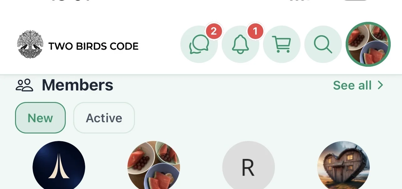
You’ll see Members is stuck at the very top on landscape and portrait any chance of some breathing space?
Lastly at home on the app, could we have a card for Community like blog that just links to the feed? Currently the only link is the bottom menu icon which isn’t apparent to users unless they click?
Even if it was an editable Title and card background image we can change.
Thanks
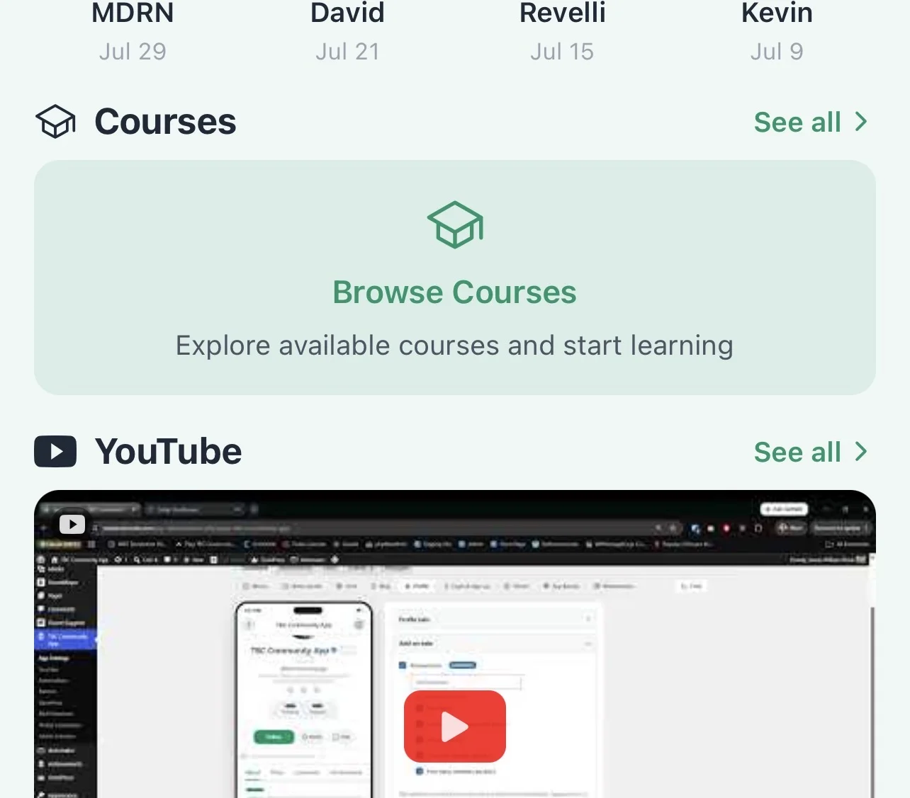

Thanks! Yes we have been expanding the courses "widget" card on homepage, and looking at adding a similar one for spaces next.