

The plugin · included with every app
Change the app while watching it change.
The WordPress half of your app. Every change is drawn on a live phone before you save — your own community’s real content, not a mock-up — and what you save reaches members the next time they open the app. No new build, no store review, no waiting.
Customize · four sub-tabs, one live phone
This is the tab you will actually live in.
The plugin also does the plumbing — sign-in, the data bridge to Fluent Community, push delivery — but the plumbing is not why you will open it. Click a tab below the way you would in the admin. Every screenshot opens full size.
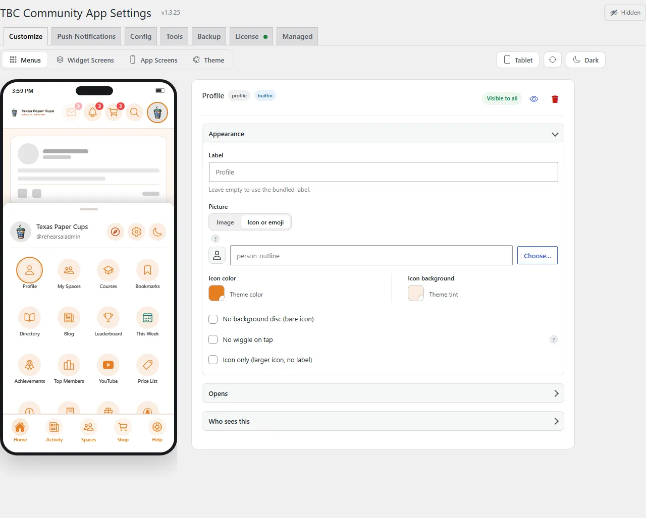
Menus
Every tappable thing, yours to move
Four navigation surfaces — the tab bar, the launcher grid, the launcher’s quick-action strip, and the header — and they are interchangeable: any item can sit in any of them, and keeps its icon, its badge and its audience rule when it moves. Drag a row from the launcher into the tab bar and it is a real tab; put it first and the app opens on it.
A row can open a core screen, a widget screen you composed, something on your site — a page, a post, a course, a space — a member’s profile, or any web link. Give it an icon from the full Ionicons set, or your own image, with a second image for its selected state.
Nothing is hardcoded chrome: even the avatar that opens the launcher and the light/dark switch are rows you can move or delete. Add-ons place their own tiles the moment they are activated.
Widget Screens
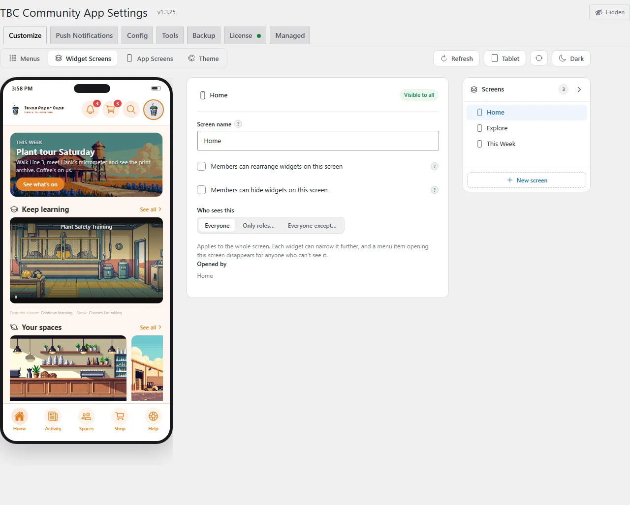
Compose app screens out of widgets
A widget screen is a named stack of widgets with its own audience rule — Home is just the first one. Build as many as you like and point a tab at one: it is a screen in a native app, and if it sits in the first slot, it is the screen the app opens on.
Every widget is repeatable — place one three times on one screen, in three layouts, and each placement keeps its own title, settings and audience. A screen holds up to 40.
Twenty widgets, and every copy keeps its own settings
This is the real catalogue, with the product’s own labels, icons and states. Seventeen ship with the plugin; the last three are there because an add-on put them there. Pick one to read what it does.
Add the same widget more than once
Everything your site can put on “Home”. Pick one to add it to the bottom of the screen — you can add the same widget more than once and give each copy its own look.
Courses On this screen ×1
Your Fluent Community courses, drawn as app cards. Add it more than once and each copy can show something different — what the viewer is taking up top, the full catalogue further down.
- Show — every course, only the ones the viewer is enrolled in, one course topic, or a hand-picked list in the order you set
- Sort newest, oldest or A–Z, and cap how many appear
- Four layouts — carousel, compact list, browse tiles, or one hero card
- Lead with one — the course they should continue, the latest, or a different one at random each time it opens
- Covers — the course image, the whole image fitted, or a plain colour tile
- Optional progress bar, lesson count and student count on every card
Members On this screen ×1
The people in your community, live from Fluent Community, tapping through to the full directory.
- Newest joiners, or whoever was active most recently
- Show or hide last names, badges, and the joined / last-active date
Spaces On this screen ×1
Your spaces, with the same four layouts as Courses. If the viewer can see none of them, the widget removes itself rather than leaving an empty heading behind.
- Show — every space, only the ones they have joined, one space group, or a hand-picked list
- Sort A–Z, newest or oldest, and cap how many appear
- Four layouts — carousel, compact list, browse tiles, or one hero card
- Lead with one — the newest space, or a different one at random each time
- Covers — the space image, fitted, or a plain colour tile
- Optional member counts
Blog On this screen ×1
Your WordPress posts, in the app, with the same four layouts and the same controls.
- Show — every post, one category or any taxonomy term, or a hand-picked list
- Sort newest, oldest or A–Z, and cap how many appear
- Four layouts, plus a lead post — the latest, or a random recent one
- Featured images shown, fitted, or replaced with a plain colour tile
- Optional date and a short excerpt
Leaderboard Inactive on site
Points and levels from Fluent Community Pro, ranked natively.
- Last 7 days, last 30, or all time — and how many places to show
- Optional avatars, and the viewer’s own rank and level pinned to it
- Both the widget and its menu row hide themselves when the site has not switched gamification on, rather than showing an empty board
Call to Action Available to add
A tinted promo panel — the widget to reach for when you want members to do one particular thing.
- Eyebrow, headline, body and one button
- A picture beside the text, rounded, or filling the whole card — or an icon or emoji instead, in a colour you pick
- Background as an even wash or a fade towards the bottom
- The button opens a space, a course, a blog post, a member’s profile, another widget screen, a page shown inside the app, or any URL
Tiles Available to add
An image or tinted tile grid, and the fastest way to build a launcher for anything on your site.
- Each tile carries its own label, subtitle, picture or emoji, colour — and its own destination
- A tile can open a space, a course, a blog post, a member’s profile, another widget screen, a page shown inside the app, or any URL
- Feature the first tile and it spans two columns, so one thing leads
- Choose which edge images crop from, so faces stay in frame
List Available to add
Full-width rows — thumbnail, label, subtitle, chevron — each pointing wherever you send it. The plainest way to offer a set of destinations, with the arrow optional.
Buttons Available to add
Pills — tinted, filled or outlined; side by side or full width and stacked; left or centred. Each one points anywhere the app can go.
Chips Available to add
Round glyph launchers with captions underneath. A leading emoji in the label becomes the glyph.
Heading Available to add
A section title in one of three sizes — title, section, or small label — aligned left, centre or right, in a colour you choose. For giving a long screen structure.
Text Available to add
Rich text, painted by the same pipeline that paints a lesson body — so it matches the rest of the app rather than looking pasted in. Three sizes, three alignments.
Image Available to add
A banner image with an optional title and subtitle laid over it, and a destination if you want one.
- Three shapes — wide 16:9, square, or a 21:9 banner
- Corners that follow your theme, or square, rounded, or very rounded
- Opens a space, a course, a blog post, a member’s profile, another widget screen, a page shown inside the app, or any URL
Spacer Available to add
Breathing room in three heights, or a hairline rule. The widget that makes the other nineteen look composed.
Video or Audio Available to add
Paste one link and it works out the rest.
- YouTube, Vimeo, Spotify, a podcast feed, or a media file
- The right player is chosen for you — you never pick an embed type
- Nothing ever autoplays
Gallery Available to add
Up to twenty images, each with its own caption and shape. A tap opens the app’s own viewer — swipe between them, pinch to zoom, save, share.
YouTube On this screen ×1
Registered by the YouTube add-on, not by the core plugin. It is in this list because that add-on is installed on the site the capture was taken from.
Top Members On this screen ×1
Registered by the GamiPress add-on. Install the add-on and the widget appears here; it is never dropped onto screens you have already arranged.
My Progress On this screen ×1
Another plugin-contributed widget. The catalogue is not a fixed list of seventeen — it is however many the site can currently offer.
Every placement, whichever widget it is: its own title (or none), its own audience rule, half width or full on tablet and desktop, and pinned above the sortable band or in it. Anywhere a widget offers a destination, the same picker opens: a space, a course, a blog post, a member’s profile, another widget screen, a page shown inside the app, or any URL.
Locked, or theirs to arrange
Every screen starts locked in your order, which suits a screen that works like a menu. On a screen that works as a home page, tick Members can rearrange widgets on this screen, Members can hide widgets on this screen, or both. Members then press and hold the screen to open a map of its widgets, drag them into their own order and hide the ones they don’t use. Lock it again and each member’s arrangement is kept for when you reopen it.
Pin, and go wide
Pin a widget above the sortable band — a welcome card, a notice. On tablet and desktop the screen becomes a two- or three-column board, and each widget chooses half or full width.
Audience, three layers deep
The screen has a rule, each widget can narrow it, and a menu item pointing at a screen the viewer cannot see is dropped entirely — all resolved on the server, so a role-gated screen never leaves a dead tab.
Previewed on four devices
The builder’s preview flips between phone and tablet, portrait and landscape — real device sizes, with a dark-mode toggle beside them — so the wide layout you are shipping is one you have actually seen.
App Screens
The screens that already exist, tuned to your community
Widget screens are the ones you build. These are the nine the app ships with — and each has a page of its own for making it yours. Pick one to see it as a member does, and what you control on it.
In the admin each of these is a set of collapsible groups, one open at a time, beside that same phone. The groups below are the real ones, with the real controls in them. The previews are drawn from your own site, so what you are looking at is your community, not a template.
Feed
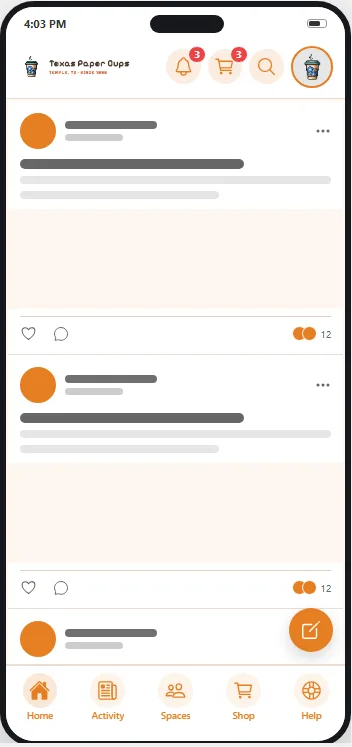
The screen most members open most often.
- Feed style
- Posts boxed or full-width — and whether members may change it in the app or you decide for them.
- Post box
- How someone starts a post: a floating bar, a floating button, or a post box in the feed like the website has. Same member-override choice.
Chat
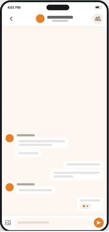
Every conversation, one-to-one and in groups.
- Message style
- Classic, the website’s look, or Modern: your own messages tinted on the right, a run of messages grouped, reactions as chips on the bubble. Same member-override choice.
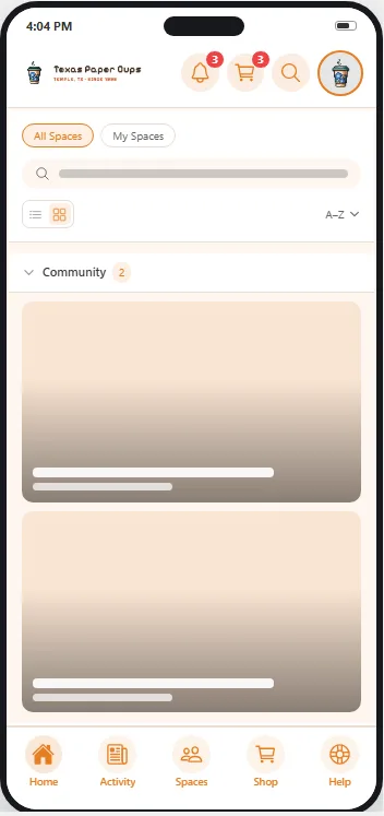
Spaces
Your spaces, and how members meet them.
- Layout
- Cards or rows, and whether members may switch.
- Sorting
- A–Z, newest or oldest, and whether members may re-sort.
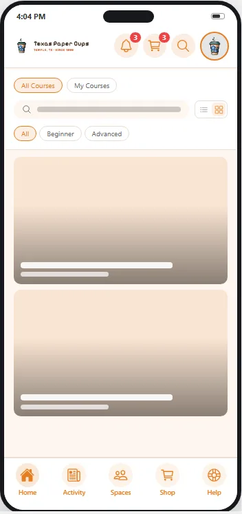
Courses
Your courses, in the app.
One panel, not two: the courses screen is always alphabetical, so there is deliberately no sort control — a stored default would configure nothing.
- Layout
- Cards or rows, and whether members may switch.
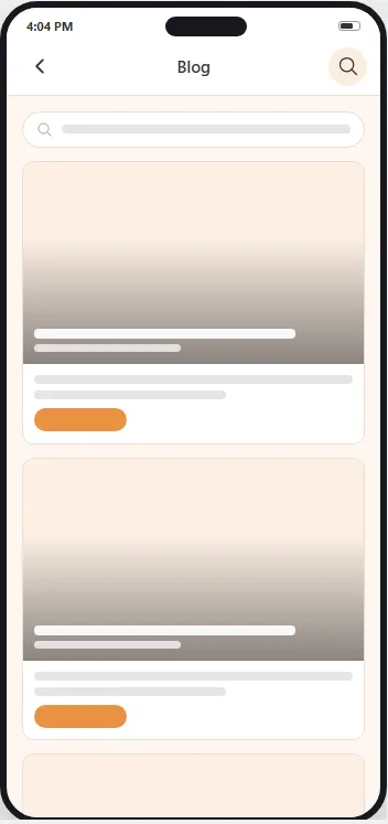
Blog
Your WordPress posts, in the app. Two sub-views, one for the list and one for a post.
Every toggle starts off, so an install nobody has configured reads exactly as it did before.
- Blog list
- A search bar, on or off.
- Single post
- Tag chips, a related-posts strip, and how many it shows — one to ten.
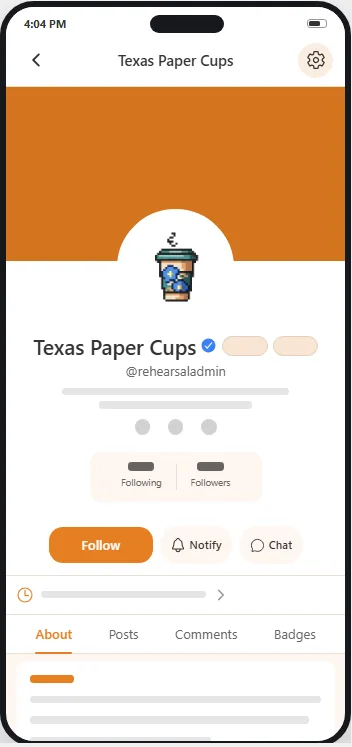
Profile
What a member’s profile offers, and who gets to add to it.
About always appears and cannot be switched off. A tab whose feature is not active on your site says so, instead of appearing and disappointing.
- Profile tabs
- Posts, Spaces, Courses and Comments, each on or off.
- Add-on tabs
- Appears only when an add-on registers one. Each gets its own switch and a name you can rewrite.
- Profile features
- Follow buttons and follower counts, plus whatever else your site has switched on.
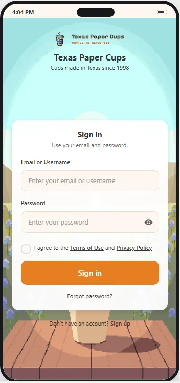
Login & Sign-up
The first screen anyone who is not signed in will ever see — three of them, really: sign in, sign up, and password. Each carries its own wording.
The copy follows your Fluent Community text until you override it for the app alone, and an app override never rewrites your site.
- What to show
- Logo, site name, tagline — chosen per screen, not once for all three.
- Registration
- Whether people can sign up in the app at all, and what to say when sign-up is closed.
- Login background
- Your image, and how it sits: fill, fit inside, stretch or repeat.
- Tablet banner
- On a tablet, the panel beside the forms looks like the banner on your website’s login page. Its colour, picture, logo and side come from Fluent Community’s login customizer.
- Password policy
- Require a minimum length for in-app sign-ups and resets, and set it.
- App lock
- Face ID or a fingerprint — off, optional, or required for everyone.
- Legal
- Pick your Terms page. The privacy policy is shown read-only, because the stores read it from elsewhere.
- Login, Sign-up and Password copy
- Form title, description and button label — plus a banner title and description on the first two.
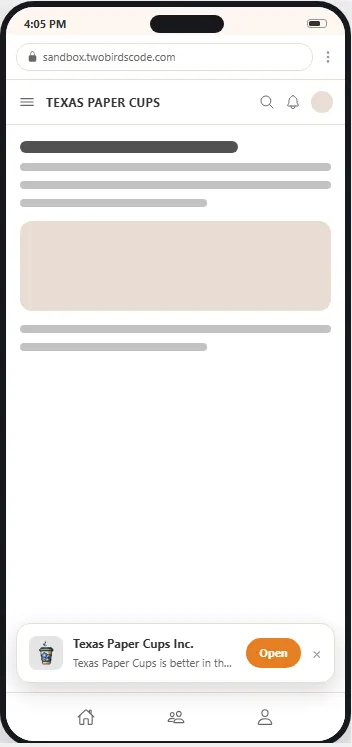
App Banner
Not a screen inside the app — the prompt on your website. When somebody opens your site in a phone browser, this is what invites them to open or install the app.
It draws inside a Shadow DOM, so no theme can restyle it and cosmetic ad-blockers cannot hide it. On Android it is a native intent link: one tap opens the app, or falls through to your Play listing.
- Show to — everyone, logged-in members only, or logged-out visitors only
- Placement — a bottom card, or a top card
- Banner text and button label, in your words
- Banner icon, inherited from your site icon until you change it
- Remember dismissal — how many days a “no thanks” sticks, one to ninety
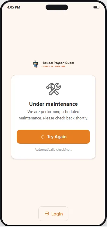
Maintenance
One switch puts the app behind a message you write, for everyone without a bypass role.
Administrators can always sign in while it is on, so you cannot lock yourself out.
- Maintenance mode
- A picture or an emoji, your message, what to show alongside it, and which roles carry on as normal.
- App update
- A minimum version overall or per platform, the store links members are sent to when they are behind, and whether a waiting over-the-air update forces a restart.
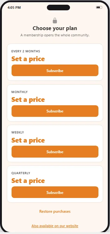
Subscriptions
Where you sell. Three sub-views: the screen that sells, the plans themselves, and what a lapsed member lands on.
Live on save except a plan’s display name and price, the two things the stores own — those go up on one sync.
- Subscribe screen
- Heading, intro line, a picture, and plans as cards or full width. Plus an optional link out to sign up on your website instead.
- Products
- One panel per plan, drag-sortable: display name, price, badge, price note, description, up to eight feature lines, button label and footnote. What it unlocks is set here too — courses and spaces answered separately as none, all, or a hand-picked few.
- Membership ended
- The title, picture and message a lapsed member sees.
The ninth screen is the one that pays for the app
Subscriptions is where you sell memberships inside the app. Purchases are native Apple and Google; access lives in WordPress. It comes with every app — not a paid add-on — and stays off until you turn it on. Two ways to sell: a membership site, where signing up is the product — or free membership, paid areas, where particular spaces and courses are what cost money, offered right on their lock screens.
What a plan unlocks is two questions, not one
All spaces, a named few, or none — and, separately, all courses, a named few, or none. A membership can open the whole community while courses are still sold one at a time. A plan can grant a WordPress role too, and takes it back when the plan lapses — but only a role it granted itself, never one you assigned by hand. Members always see the store’s real localized price in their own currency.
Verified, not trusted
Your site verifies every purchase itself: Apple transactions against Apple’s own root certificate and then Apple’s server API for their state right now; Google notifications are treated as hints and re-read from Google’s API before anything changes.
Your existing members are safe
A member who did not sign up in the app is never gated — switching on a paywall cannot lock out the community you already have. Administrators are never gated, whatever happens.
Theme
Your colours, or the app’s own
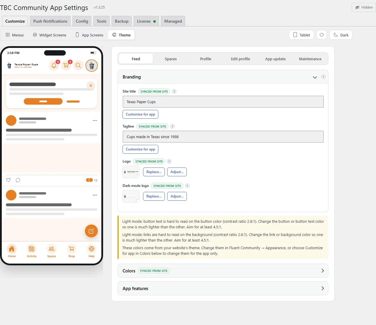
The app inherits your Fluent Community colours by default. Override any of them for the app alone — hover a colour and the preview repaints everywhere it is used, and if the screen on show does not use it, the phone switches to one that does. Six presets ship, and each dresses the whole app rather than swapping one accent: top bar, tab bar, buttons and links together.
None of it touches your website — no control on any Customize page writes a site setting — and none of it needs Fluent Community Pro.
The other six tabs · administration
It matters on the day you need it, and not before.
Every field carries a ? that says exactly what to enter and where to get it, with Show me the steps walkthroughs beside the fields they describe. Same window as above — click a tab.
Push Notifications
Every push the app can send, on one page
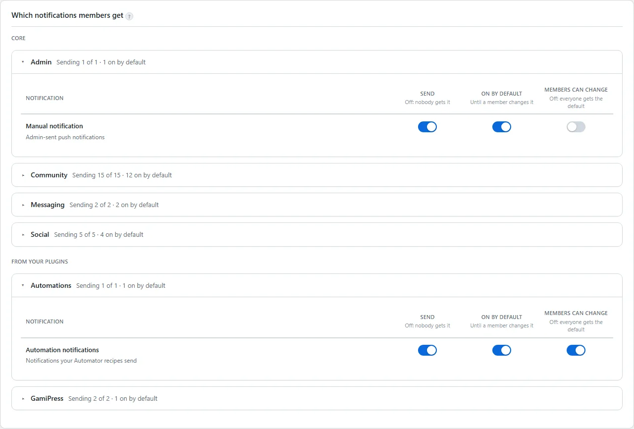
The on/off switch, then six groups of notifications. Each one is a row with three switches — Send, On by default, and Members can change — and each column says in one line what its switch does. Sending one yourself, a test to your own phone, the phone count and the log sit on the same tab.
- This is the site-wide gate: off means never, whatever a member has chosen
- A count per group, so you can see what is live at a glance
- No Apple or Google credentials ever live on your server
Config
The switches you touch once
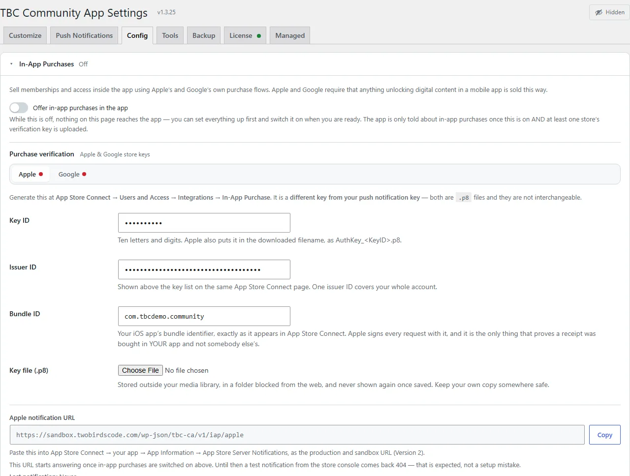
The two files that let a notification tap open the post it is about rather than the app’s front door, in-app purchases, crash reports, extra CSS for the web pages the app opens, and the staging site. Each setting sits beside its test.
- Subscriptions master switch, selling mode and store keys live here too, with a test of Apple’s notifications under the URL it checks
- Deep-link files for iOS and Android, with a check that they resolve
- Crash reports already set up, with a button that proves one arrives
- Staging Site: your staging copy and a sandbox per person, and who may switch the installed app to them
Tools
The cards for the questions you would otherwise wait for a member to ask
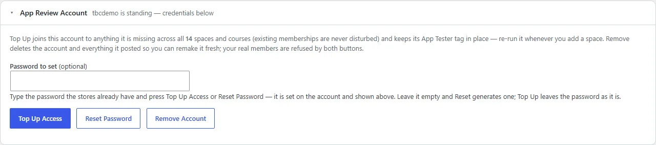
Every signed-in member and device, and diagnostics — the first place to look when something works on the website and not in the app. Then the two cards for getting through App Store review, side by side.
- Review account — builds the demo login Apple and Google both demand, joins it to everything, and says in one line whether it is ready
- Review cast — a throwaway dummy member, secret space and unread chat for the screen recording Apple asks for, so you are not filming real members
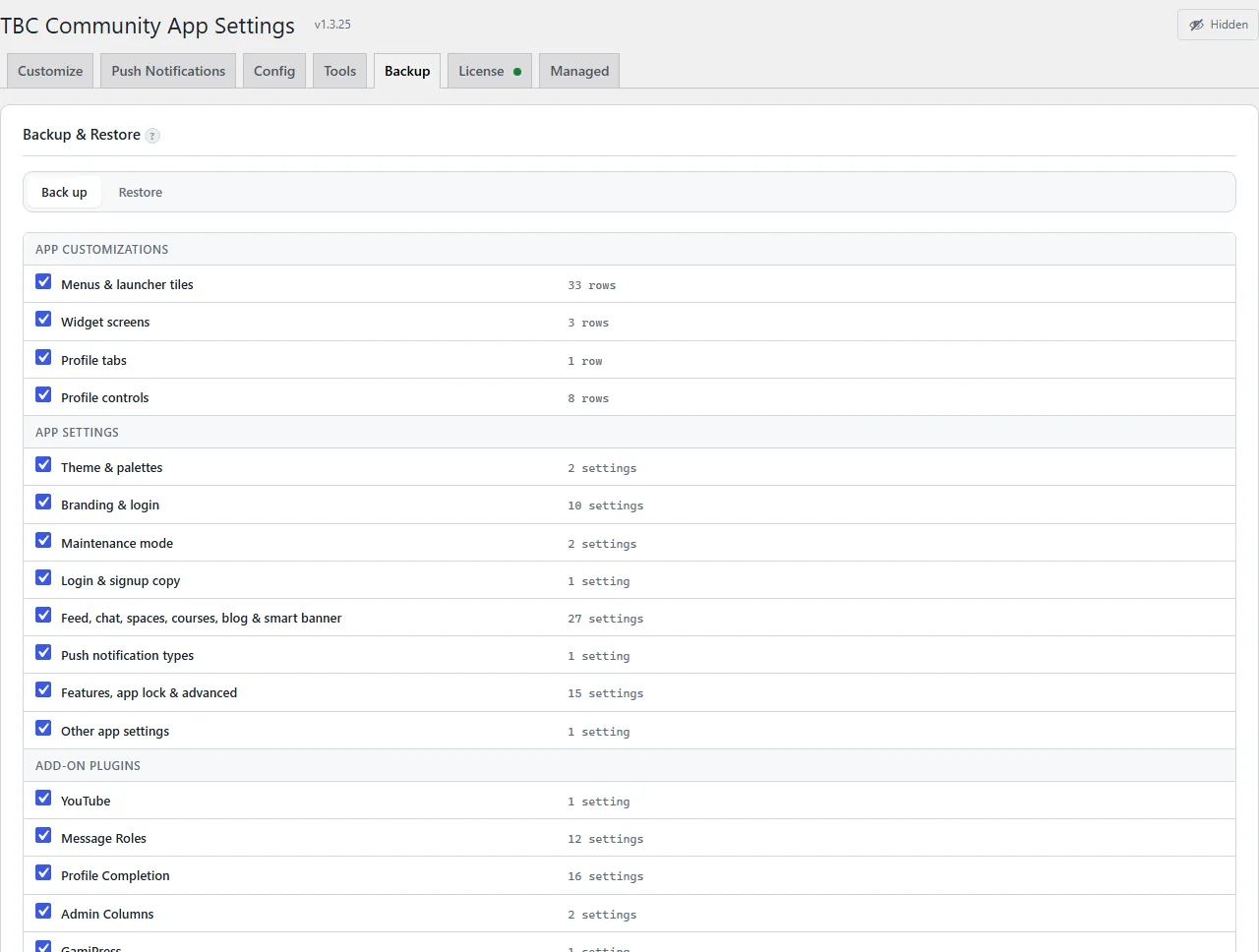
Backup & Restore
The whole authored state, in one file
One zip carries what you built: menus, widget screens, theme, branding, push types, the build identity. Carry it to a staging site, or keep it before a big change.
- Nothing is written on restore until you have seen a row-by-row diff
- Nothing is written at all until a rollback is on disk
- Exporting always works, licensed or not — you can always get your own data out
- It is not a database backup and does not replace one
License
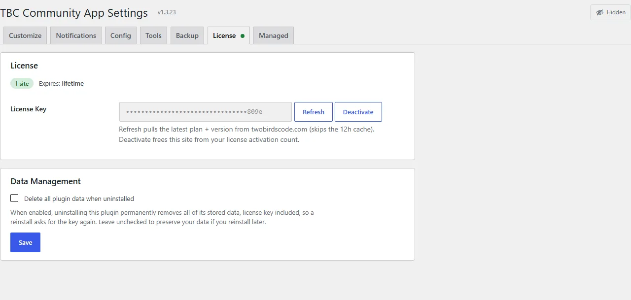
One key
Activate it, check it, or move it to another site. That is the whole tab.
- Shows which tier the key is — Dev Bundle or Managed — and when it renews
- An expired key stops updates, not your app or your members
Managed
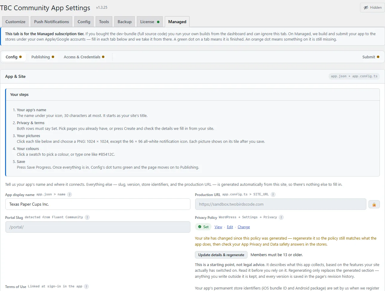
If we are building the app for you, this is where you hand us what we need
Managed-tier only — ignorable on the Dev Bundle. Every prerequisite for building and submitting under your own Apple and Google accounts is set up and collected on this one tab, each card with a step-by-step walkthrough beside its fields.
- Assets — your logo, app icon, splash image and store screenshots, uploaded here rather than emailed
- Identity — app name, bundle ID and package name
- Store listings — the words the stores show, written once here rather than typed into two consoles
- Accounts — the access we need to your Apple Developer and Google Play accounts, and a readiness check that says what is still missing
Two ways to get it built
The same plugin either way.
Dev Bundle
The full source and the setup dashboard. You configure, build, submit and update it yourself, under your own store accounts.
Managed
Not building it yourself? We build and submit under your own Apple and Google accounts — you fill in your details on the plugin’s Managed tab.