TBC App - Community App (Dev Bundle)

SKU: TBC-APP-DEV-BUN

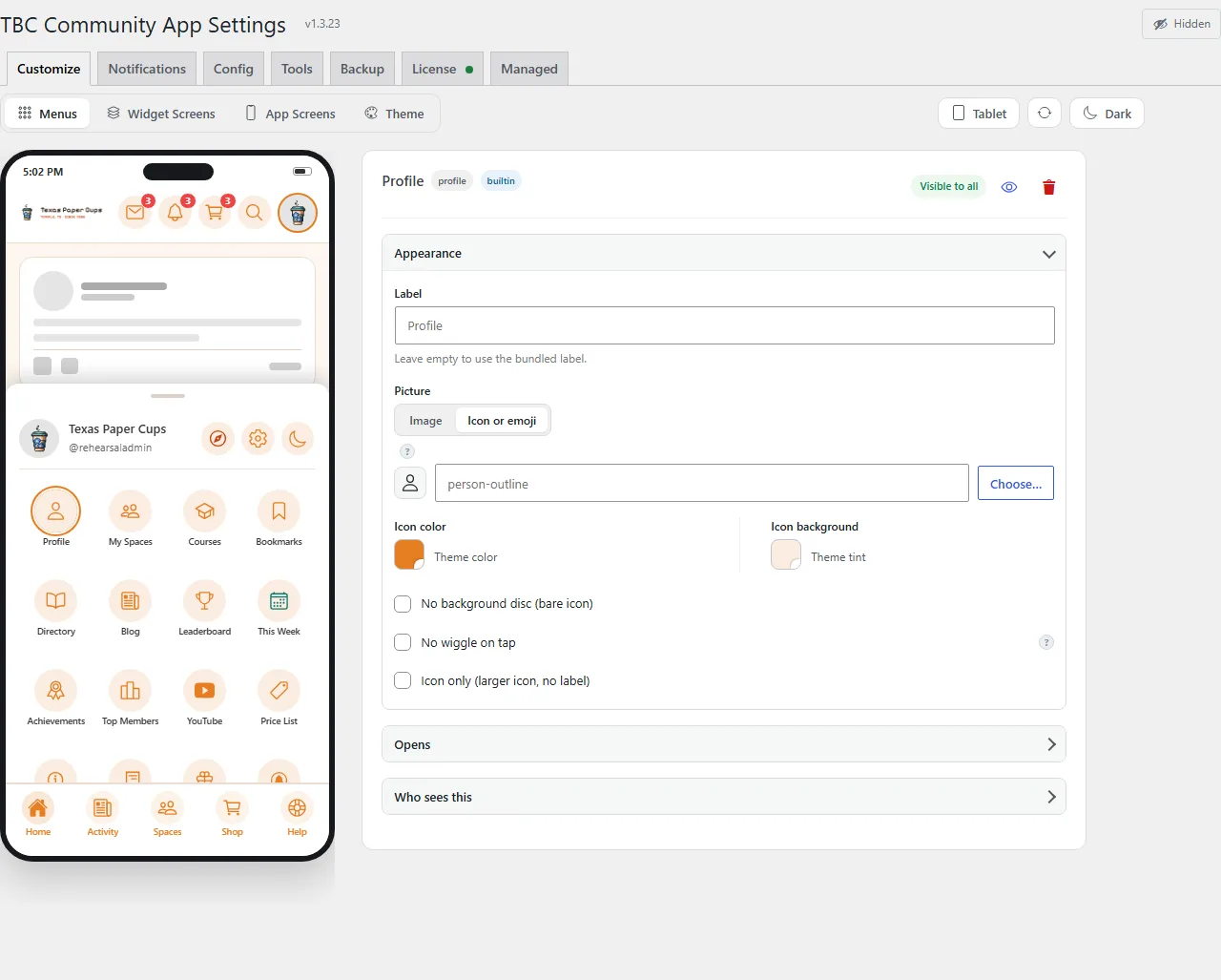
The full React Native source plus the build dashboard. Configure your site, drop in your assets, and ship to both stores yourself — no coding required.

$50.00
$50.00 per year + $399.00 one-time Lifetime license

v1.3.14
Changelog · v1.3.14

1.3.14 — 2026-09-03

📱 What's New — store release notes

  • Audio follows you: a mini player stays in reach on every screen, with 15-second skips, playback speed and tap-to-seek, and play picks up where you left off.
  • Group and space chats: search the member list, and moderators can quiet a member or remove a message. When you can't post, the chat says why.
  • Quick notices replace pop-ups for things that just worked; the app only interrupts with a real question.
  • A purchase that went through is honoured even if the store showed an error.

✨ New

  • Audio follows you around the app. Playing a recording — a clip on the feed, audio in a lesson or a post — keeps going while you scroll away or open other screens, with a persistent mini player above the tab bar (and a floating card on screens without one) to pause, stop, or jump back in from anywhere. The app remembers where you were in everything it played this session, so a short clip can interrupt a long recording without costing you your place, and pressing play resumes exactly there. Signing out stops playback and forgets it all.
  • Every audio row is a full player. Play/pause, back and forward 15 seconds, a playback-speed control (0.75×–2×, pitch-corrected so voices stay natural), a seekable progress bar, and elapsed / total time — matching the website's player and then some.
  • The update screen can offer "Not now". A new Customize setting lets the required-update screen be skipped — for everyone, or only for chosen roles — so an app-store reviewer (or your team) is never walled off by a version gate. Off by default; administrators always qualify.
  • Chats catch up with Fluent Messaging 2.9. The composer now knows every reason it might be closed and says which one: you blocked them, they blocked you, an admin has quieted you here, you left this chat, their account is gone, or you may not post in this thread. Moderators of a space or group chat can block a member from posting — and unblock them — straight from the member list, where blocked members stay visible so they can be let back in; group admins and space moderators can remove any member's message. Member lists in both info sheets search on the server and page properly, so a roster larger than one page no longer simply ends. A reaction the server refuses now tells you why instead of appearing and quietly vanishing, and the message action bar only offers what the thread actually allows. Every new field is optional, so a community on an older Fluent Messaging behaves exactly as before.
  • The space editor and the composer follow Fluent Community 2.9.1. The "new topic" button in a space's settings shows only for community admins, the people the server will accept it from; reading topics stays open to space and course admins. A post the site refuses for a reason it names — empty, too long, missing a required title — is explained in your own language rather than the site's, and the course unlock sheet gained the same treatment.
  • A purchase that goes through is never lost. Every purchase now carries your account with it to the store, so if the store reports an error after you have paid — it happens — the app checks with your community over the next few seconds and lets you in as soon as the purchase lands there, with nothing to restore and nothing to reinstall. When a purchase genuinely fails, the message now names the store's own reason code, so a screenshot tells support which failure it was.

🛠 Fixed

  • A member who blocked you no longer gets a live composer. Fluent Messaging 2.9.0 stopped writing the field the app read for "they blocked me", so on an upgraded site the composer stayed open and every send failed with a red notice and no explanation. The app reads the new block fields, and the composer closes with the reason. Two older gaps went with it: opening a chat you had left from a push notification showed a working composer, and a member the server had quieted could still type.
  • The sign-in button always answers. On a community that requires agreeing to the terms before signing in, the Log In button was disabled until the box was ticked — and a disabled button gives no press, no haptic and no message, while its dimming was faint enough to look live. An App Store reviewer read that as a button that did nothing. Tapping it now says "Please agree to the terms to sign in" and outlines the unticked box in the error colour; sign-up does the same.
  • The fractal pull-to-refresh scene fills its frame and dives inward, instead of drawing small and pulling away.
  • A Google Play subscription buys the best offer you are eligible for. A product with a free trial or an introductory price beside its plan used to purchase whichever offer Play listed first. The app now picks, within the plan whose price the card showed, the offer with the cheapest opening phase — Play only lists the ones the member qualifies for, so that is the trial or the intro price when there is one, and the plain plan when there is not.

🔧 Changed

  • The app tells you, it doesn't stop you. Things that simply worked — a post saved, a link copied, a setting applied — now announce themselves as a brief notice that dismisses itself, instead of a pop-up you must tap away. Real questions still ask properly. Alongside it: screens open on content-shaped placeholders rather than spinners, transitions share one motion language, and every text field carries the app's own caret and keyboard styling.

🖥 Dashboard & builds — if you build your own app

Ship: Needs a new build — the Expo SDK 57 patch set (React Native 0.86.3) and, for IAP apps, expo-iap 5.5.0; build from the dashboard's Build tab.

✨ New
  • Every card is an accordion. A tab opens on its first card; clicking a header opens that card and folds the one that was open, the same way the setup guide's sections and the plugin's admin already behave. A control in a header — Refresh, Turn on, Upload — still does its own job without folding anything, and a "Go to setting" link opens the card it points into before scrolling. Updates gets real cards for the first time, Core and Modules, and a folded header still answers the question the tab exists for: "v1.4.0 available", "2 updates available".
  • Apple's Age Rating is one card walked in steps. The questionnaire's five groups — Violence, Mature themes, Gambling and contests, App capabilities, Kids and overrides — were five cards. They are one card now with a row of pills across the top as the map: any step is one click, Back and Next walk them, and a pill ticks green once every question in its group has an answer.
  • Screenshots have a look, and each one has a say. A template gallery above the screenshot grid — Classic, Bold, Tilt, Depth, Minimal — restyles the whole set at once; each thumbnail is your own first capture drawn small, so what you pick is what publishes, and Classic is the output you already had. Every slot then takes its own Position, an optional laurel badge above the caption ("4.9 ★ on the App Store"), and a zoom callout — a lens on the device's edge magnifying one spot you pick by clicking the preview. Depth is a real turned phone, not a skew, at an angle that keeps the app readable.
  • The Play feature graphic is drawn from that same look. Under the two Store Graphics slots, a preview built from your template, logo mark, brand colours and first capture, a tagline of up to 120 characters, and Save as feature graphic, which writes the 1024×500 render into the slot above exactly as a dropped file would. The old one-colour banner generator is gone; the listing and the screenshots now read as one set.
  • Fix an icon or splash image in the preview instead of in Photoshop. The device preview could already show that a foreground filled its canvas past the launcher mask, or that a splash image was smaller than the slot wanted — but the only remedy was a round trip through an image editor to do the same two transforms every time. Adjust artwork now sits under the preview: a size slider, drag to move the artwork on the tile itself, Fit to safe zone (scales to sit inside the circle no launcher clips) and Centre (works off the artwork's real bounding box, so an off-centre logo lands in the middle). Apply re-renders the PNG at the slot's recommended size and stages it like an upload, so the save bar still has the last word. An undersized source offers an explicit resize up, which clears the "smaller than recommended" warning. The iOS icon and the adaptive background are deliberately not adjustable — the first forbids transparency, the second is a full-bleed layer. Each tile's preview button now turns amber and names the defect when a branding check fails, the same checks the Builds tab lists, so the two can never disagree. Also: starting the dashboard with a flag such as --no-open no longer registers a phantom app named after the flag.
  • A build tells you when your modules are behind. Before a build starts, any app whose installed modules are older than what the store publishes now says so by name — Calendar 2.0.5 → 2.1.0 — in the fleet's preflight and as a banner on the app's own Build tab, with a jump straight to Updates. It matters because the binary ships the module code that is on disk, and the only way back afterwards is an OTA, which leaves the store build and the running app disagreeing from the day it lands. It is advice and never a block: holding a module back is a legitimate choice, and a deactivated module is left out entirely, since a build cannot ship what it does not contain.
  • A Play release blocked by a review now offers you the choice. Google runs one review queue per app, so a screenshot push from hours earlier can refuse a release — something the Play Console releases page never mentions. The dashboard now names what is happening and offers the same two answers Play Console does behind the same warning: wait for the review to finish, or cancel it and restart, carrying this release with it. Users stay on the current version either way. The dashboard will never take the second on its own — every other commit it makes refuses outright — and a listing push that Google forces into review now says so in the terminal as it happens, so the release it blocks later is not a surprise.
  • The listing defaults answer the two questions most often got wrong. New listings now propose "a sign-in is required to use the app" — this core is login-gated with no guest mode, so a reviewer who cannot sign in sees the login screen and nothing else, one of the most common first-submission rejections — and Apple's third-party-content declaration, which is already true of a stock install before a single module is switched on. Both stay proposals you can untick, and your demo credentials remain yours to fill in.
  • The App Review notes answer the background-audio rejection before it arrives. Every build on this core declares the iOS audio background mode — expo-audio's config plugin writes it at prebuild, so nothing in app.json shows it — and a reviewer who never stumbles onto an audio post sends the standing "unable to locate any features that require persistent audio" letter. The notes now name what actually sounds in your build, read from the project so Courses and an audio module are claimed only when they really ship, and say that playback survives backgrounding and the lock screen. The sentence about your recording is gated on your own yes: answer "not yet" and the generator refuses rather than send a reviewer hunting for something the clip never shows. If your community genuinely never posts audio, the card says so when the build declares the mode and carries nothing that plays, and names Apple's own fix — which is a native field, so no OTA can remove it.
  • And the question our own vocabulary invites. This core calls the cards on the Home tab widgets, so a reviewer who reads that word goes looking for a Home Screen widget, fails to find one, and opens a hold on an app that has no extension of any kind. The notes now deny all of them at once — Home Screen widget, Siri and Shortcuts, share, action and notification extensions, App Clip, watch app — and explain that "widgets" is our own word for cards that never leave the app. It prints only while the project builds no extension: add one and the denial gives way to a warning, because a denial a reviewer can disprove is worse than silence.
  • The screenshot frame has a finish, and the feature graphic a layout. A Frame picker beside the template chooses the drawn phone's shell — graphite as before, or a light bezel — and the setting travels with the template in store-assets/. The Play feature graphic can now stand its screens as a single, a fan or a row, on either side of the tagline. In captions and the tagline, a word wrapped in asterisks draws in your accent colour; the asterisks never change the wrap, so accenting a word cannot reflow a line.
  • A fifth answer for how members pay: a shop selling things used elsewhere. For a community that is free while the site runs a shop — tickets, bookings, real-world services, merchandise, software your customers install on their own sites. It is not a softer version of the free answer but a different claim: Guideline 3.1.5(a) does not merely permit a non-Apple checkout for goods consumed outside the app, it requires one, so naming your web checkout is the compliance argument rather than an admission. It turns entirely on where the thing is used and never on whether it is physical — the moment one item unlocks a space, course, badge or feature inside the app, the whole app moves to in-app purchase.
  • Dependencies caught up before the build. Every Expo SDK 57 package moves to its current patch — expo 57.0.19, React Native 0.86.3, expo-updates 57.0.21, expo-router 57.0.18 and the rest — along with the in-range libraries behind them. The In-App Purchases pin moves to expo-iap 5.5.0 (still Play Billing 9.1.0): Play's purchase listeners are restored after a reconnect, StoreKit 26.5 symbols are gated on older systems, and offer-code redemption sits behind one call on both stores. The dashboard re-pins it for every IAP app on this update; nothing else to do.
🛠 Fixed
  • Activating a module on a fresh install registers it. A new project ships its module registry with the array on one line, and the writer looked for a closing bracket on a line of its own — so the import went in, the entry never did, and the dashboard reported "activated" while still offering Activate. The registry is now read by a bracket scan that does not care how it is laid out; a multi-line array is edited line by line so your comments and commented-out entries survive a toggle byte for byte; and nothing is written until both halves have been verified. Remove and Import stop rather than half-finish when the registry cannot be read, and say so. Two neighbours went with it: deactivating the last module now leaves the [] a fresh install ships rather than an empty bracket pair on two lines, and updating a module while it is switched off no longer re-creates its route stubs — a deactivated module owns no files under app/.
  • A core update that changes a dependency says "build", never "OTA-safe". The verdict after a core update compared the core version your last build came from against the core's last native change — right across versions, blind to a repackage at the same version. So a core rebuilt with new Expo packages could report "nothing native has changed" in the same breath as "dependencies installed". The updater now diffs your package.json before and after the core lands, and any dependency that changed version, arrived or left is a build: the reason names them — expo 57.0.13 → 57.0.19, react-native 0.86.2 → 0.86.3. The version comparison still answers when nothing moved.
  • A core update no longer spends minutes on dependencies it did not change. After every update the dashboard ran a full npm install, and that install ran npm audit — which posts the whole dependency tree to the registry and can wait minutes for an answer nobody reads — while also standing in the same line as every eas-cli command, so during a fleet run it queued behind build uploads before it even started. Three things change: npm runs with audit and funding notices off, it runs directly rather than through the eas-cli line, and it runs only when the update actually changed a dependency or the project has no node_modules yet. The fleet row says "dependencies unchanged" when it was skipped. On an up-to-date project the step went from about four minutes to two seconds.
  • Add-ons install on a fresh app again. An add-on's minimum version is a core version — the number in manifest.json — but the compatibility check read the buyer's own app version, which every fresh white-label install starts at 1.0.0. So Better Messages, GamiPress and any other add-on declaring a minimum were refused with "requires app version 1.3.3+ (this project is 1.0.0)" on exactly the install the check exists to protect. Both the import and the fleet's pre-check now compare the core version, and say "core" when they refuse.
  • The App Store Connect key upload checks the Key ID it was given. Dropping a .p8 was meant to fill the Key ID from the filename and warn when it did not match the field — neither ever happened, because the comparison read a value that did not exist. Both work now.
  • Screenshots reach the store. A full Android set is past the dashboard's JSON ceiling once the rendered captures are encoded, so publishing or exporting one failed with "Request body too large" and nothing ever arrived at Google. The two routes that carry images now have a ceiling sized to the real payload.
  • The fleet submits the build that can actually ship. A preview, development, internal or simulator build finishes exactly like a production one, so the newest-finished picker could hand an internal binary to a store submit. One rule now answers "is this a store binary?" for the fleet and the per-app pipeline alike, the skip line says why a green preview build is not the one going out, and the duplicate-version warning no longer invents a clash by counting builds no store could have taken.
  • Pre-build warnings stop overwriting each other. A row can carry more than one — quota, duplicate version, modules behind — and the last one written no longer erases the rest. Each is typed too, so a struck-through platform pill matches the warning it belongs to instead of being guessed at from the wording; a module with "iOS" or "Android" in its name used to light the wrong one.
🔧 Changed
  • The review notes are yours to answer, and the card has stopped going to look. Generating them now reads this project and the answers on the card and nothing else — no request to your site while it composes. What went with that is the second-guessing: the notes no longer check an answer against a menu or a product list fetched signed out, refuse the answer you chose, or warn that the two disagree. Those checks could only ever be partly right — a row limited to members is invisible to an anonymous read — and the wrong half of a half-truth is a card arguing with the person who set the site up. Only one answer's output changes: subscribe-in-the-app no longer lists each product by name, period and price, and states that they are mirrored to App Store Connect instead, which is where the reviewer's own product pages are and what they check against. Every other answer generates exactly what it did before, word for word.
  • One less setting to get wrong: the EULA footer follows your answers. Apple wants a Terms of Use link in the listing of any app selling an auto-renewable subscription, and its standard EULA has no field of its own — so the push appends it to the App Description. Choosing when that happened used to be a three-way setting on App Details whose default, Automatic, worked it out by reading the site's product catalogue. The setting is gone and the footer is simply derived: it goes on when the App Review Notes card says an in-app subscription is sold under Apple's standard EULA, and not otherwise. You answer it once, where you were already answering it. It also settles a case the old default got wrong — an app with a CUSTOM EULA uploaded to App Store Connect had the standard link appended over the top of it, because Automatic only ever asked whether a subscription was on sale.
  • The release is one card per store. Connection, Version & Release and the three shipping steps used to be two cards on Play and three on Apple, with a Test connection button on one and a Refresh on the next that did the same thing plus more. They are one card now, titled with the version it is about, at the top of the Publishing tab; the listing forms — set once and left alone — sit underneath it. One Refresh, in the card header, re-reads the connection and the build list together.
  • Export ZIP is gone from Store Screenshots. Screenshots only ever went to the store, and the flattened images were never what the project kept — the captures, captions and template settings in store-assets/ are, and the snapshot already carries them. A second place to "export" with nothing to do with the result was a question, not a feature. Publishing through step 3 of the release card is unchanged.
  • Builds is one card. New Build and Recent Builds were two accordion cards, so you could never see the build you were starting and the ones that had finished at the same time. They are one card now: the allowance, the version row, the two platform columns and the Build button, then a rule and the recent builds beneath with their own Refresh. The list shows the newest five with a "Show N more" when there are more, and a build in flight is always shown.
  • Module routes are the map form, full stop. A module manifest still declaring routes as an array of hand-written stub files is now read as unreadable rather than as a module with no routes: activate generates nothing for it, and export refuses it and names the map form to use. The only zips ever built the old way were ours, and both have been rebuilt.
  • The guide explains; the dashboard acts. "About OTA Updates" and "Still set in the console" were cards of prose with no control on them, repeating what the setup guide and the store-publishing doc already cover in full. Both are gone; the OTA tab and the Publishing tab open straight onto the cards that do something, and the guide keeps its OTA-safe table and console-only list.

📡 OTA & Internal

  • The Pusher provider owns the connection and nothing else: the typed event-listener hooks live in hooks/usePusherEvents.ts and the ticker poll moved into UnreadCountsProvider beside the badge state it corrects, which removes the import cycle between the two contexts and the mount-order rule it implied.
  • Chat member-search results are excluded from the persisted query cache; the unfiltered roster still persists.
  • LoadMoreButton (components/common/ListFooterLoader.tsx) is the one tap-to-page footer; the chat info sheets and "Load earlier" use it instead of three hand-rolled copies. useThreadMemberRoster holds the roster paging, search and block flow both info sheets share.
  • errorMessage() takes an optional per-call map of server codes to translated keys; the ticker's route field is typed as NotificationRoute.
  • The dashboard frontend is no longer one file: the page is stitched from parts under setup/frontend/, each tab is its own Alpine component and the shared state lives in three stores (nav, ui, app). Same page served, byte for byte, before the components moved in.
  • The sheet overlay decision (native modal or not) reads navigation state through useSyncExternalStore instead of a ref during render, and the overlay is a module-level component; same behaviour, and the react-hooks lint rules are green again.
  • One global audio player (components/media/NowPlayingContext) behind every inline row and the bookclub module — rows are remote controls, position memory is per-session and cleared through the cache registry on logout, and the NowPlayingBar seeds the tab bar's addon slot the same way core header addons do.
  • GateScreen owns its footer slot's chrome; ForceUpdateScreen and MaintenanceScreen hand it bare content.
  • IAP: the member's app account token rides on every purchase request (services/iap/native.ts, read off iap.account_token); IapHost owns the re-read after a store failure the app cannot explain and announces a recovered outcome on the purchase bus, which a surface treats exactly as verified; such failures are captured to Sentry with their code; iap.errors.storeFailed takes a %{code} slot in all three locales.

1.3.13 — 2026-08-29

📱 What's New — store release notes

  • Open the app with no signal and everything you have already read is still there.
  • Lesson and feed audio keeps playing when your screen locks.
  • On a tablet, lists fill the width in columns instead of one long column.
  • A photo in a post shows at the shape it was meant to.

✨ New

  • What you have opened stays readable offline. Posts, lessons and conversations you have already seen open again with no signal, and the writes that can wait — a reaction, a bookmark — are held and sent when you are back.
  • Audio keeps playing with the screen locked. A lesson or a feed recording carries on when you put the phone down, with the title and controls on the lock screen.
  • Tablets use the whole screen. Card lists flow into columns instead of one tall column, at a width the app picks from the screen it is on.
  • Attachment previews stay put while you type. A picture you have attached pins above the toolbar and stops scrolling away with the message.
  • Tap an attached picture to see it properly. The thumbnails are half the size they were and carry no close button — tap one and it opens full screen, where you can zoom in, save it, or remove it. Same in chat.

🛠 Fixed

  • The iOS photo picker opened behind the composer, so tapping attach appeared to do nothing. It comes to the front.
  • The composer sheet grows to make room for an attachment preview instead of cropping it.
  • The in-app browser identifies itself like every other request from the app, so a site firewall recognises it as the same visitor.

🔧 Changed

  • A lone photo in a post is sized by a setting — cropped the way the website crops it, contained whole, or full width.

🖥 Dashboard & builds — if you build your own app

Ship: OTA-safe — JS-only, push from the dashboard's OTA tab.

  • Data Safety is a row in Review & publish, not a separate Send button, and it reads unknown rather than not set for Google — there is no read-back to call it either way.
  • The 3.1.2(c) disclosure an app selling a subscription has to state is appended to the store description on push, so nobody retypes it or forgets it.
  • A failed EAS command says what actually died, and the child process gets a heap the machine can honour.
  • Store screenshots have an orchestrator and iOS capture, with redaction and geometry guards that fail rather than quietly shipping a wrong picture.

📡 OTA & Internal

  • /release produces one plan across every surface — store, pictures, copy and courses — to approve once instead of four commands run in hope.
  • Publishing leaves a stamp, so "what has landed since we shipped" is a real question rather than a memory.
  • A catalogue of every documentation surface, mapped to what it documents.
  • Courses are authored from files in scripts/courses/definitions and re-synced on demand.
  • Each zip folder keeps its newest five versions; older ones sweep into archive/.

All notable changes to the TBC Community App white-label product.

1.3.12 — 2026-08-26

📱 What's New — store release notes

  • Signing up works again on communities that email you a verification code.
  • Links open the mobile version of your site, not the desktop one.
  • Plans say what they include, and one-time buys no longer mention renewing.
  • You can buy access to just the spaces or just the courses a plan covers.
  • Links on the sign-in and sign-up screens are tappable again.
  • Signing up asks you to agree once, and names both documents.
  • Communities behind a strict firewall can reach the app again, on both phones.

✨ New

  • A plan can open some of your spaces and all of your courses, or any other mix. The app's paywall used to offer one choice per plan — everything, some spaces, or some courses — which could not express the two shapes most communities actually sell: a membership that opens the whole community while courses are bought separately, and a course bundle that covers every course including next month's. Spaces and courses are now asked separately, each set to none, all, or a picked list, and a plan can also grant a WordPress role on top. All keeps meaning all: a space created later reaches the members already holding that plan.
  • A repair pass for access that drifted. Changing what a plan unlocks used to reach new buyers and nobody else, and a member who lost a space some other way never got it back. Tools → Re-apply access brings existing members in line with today's plans — one member or all of them — and removes access a narrowed plan no longer covers.
  • Choose who grants access: the plugin, or your FluentCRM tags. On a site using Fluent Community Pro's tag-driven Access Management, two systems were about to be granting the same memberships and reacting to each other. Now it is one radio: the plugin joins spaces itself, or it touches no space at all and simply applies the tag each plan names. Full reasoning in the companion plugin's changelog.
  • A purchase can be given back from the Subscribers screen. A ledger row records who owns a store purchase, and only a store notification could ever change it — so an order pointing at a deleted account could be neither restored onto a new one nor bought again, because the store still considered it bought, and there was no way out of the admin at all. Three actions now exist on the Subscribers modal: Unlink releases a purchase to nobody, so the next Restore Purchases claims it, and rows bound to a deleted member are badged Stranded; Reassign moves it onto an account you name, recorded with both member IDs and the admin who did it; Delete erases the record on sandbox rows only. Deleting never un-buys anything.
  • The app keeps a log a member can hand you. "It didn't work" is the hardest support ticket there is, and until now the only way to learn anything was to be holding the phone. The app now keeps a rolling trail of what it did — always on, the last few hundred lines, with values redacted where they are written — and a Diagnostics sheet gathers it with the version, the platform and the session facts behind one Share button, so a member can send you the whole picture from their own phone. It opens by long-pressing your logo on any screen, including the sign-in screens where the problems that matter most happen, or from Settings → About → Diagnostics. A Verbose switch turns on the fine-grained trail for 24 hours and then turns itself off again, writing to a file that rotates at 1 MB and is deleted when the window ends — so the detailed mode cannot be left on and cannot fill a phone. Render crashes and failed logins are written into the trail as they happen, rather than needing to be reproduced.
  • The Widget Screens builder previews your real content. Every widget's phone preview drew a grey skeleton, so a buyer arranging their home screen was arranging placeholders and only found out what it actually looked like after saving and reopening the app. Widgets now name what they show, and the preview resolves it to the site's own titles and thumbnails. Add-ons contribute their own preview sources through the same filter rather than each inventing a path.

🔧 Changed

  • The companion plugin can hide its sensitive values. Its settings screen showed the reviewer demo login, the contact details and the tester picker — a list of members by email address — in plain text, with nothing to cover them for a screen share or a screenshot. A Hide sensitive toggle now covers them, and the shared admin library carrying it is in every plugin in the suite, so the same control appears wherever fields are marked.
  • The shared admin library loads the newest copy, not the first one. Every plugin carries the same library under one handle and WordPress kept whichever registered earliest — so a plugin shipping an update ran against a neighbour’s stale copy until the whole suite caught up. Compared by file date now. This is what made the toggle above work at all, and it fixes every future library change with it.

🛠 Fixed

  • A member filling in a profile field at the completion gate now sets off whatever you built around it. The gate saved through a different door from the profile page, so automations waiting on a field never heard about it — while the same field edited on the website fired normally. Both are the same event now. Ships in Profile Completion 1.7.5.
  • A strict firewall could block the app outright, and there was nothing a buyer could tell their host. Android identified itself as okhttp/4.9.2 — the bare name of its HTTP library, and the same string bots send. The ModSecurity and Comodo rulesets standard on cPanel hosts reject it on sight, and no site owner can allow okhttp without allowing every scraper using it. Every request the app makes now says TwoBirdsCommunity/<version> (<Platform> <os>; TBCApp). TBCApp is fixed in every app built on this core, so a host whitelists one token, once, for every buyer. Verified against a genuinely blocked site: same request, same everything, only the header changed — okhttp gets a 403, the named agent reaches the plugin.
  • **…and every way out, not just the obvious one.** The first pass covered API calls and Android's images, which left a host that had allowed the token still seeing broken avatars on iPhone and silent audio on Android. Auditing every outbound path found four more: audio builds its own HTTP client, video sends a different library's string, file downloads sidestep the factory entirely, and on iOS no media path carried the token at all. All of them carry it now — images, audio, video, downloads, sockets and the in-app browser, on both platforms — from one shared definition rather than copies that drift.
  • Diagnosing it is now one tap. Working out that a host was refusing the app took two weeks the first time. The Diagnostics sheet gains a Connectivity section that asks your site to echo back what it actually received, and shows the agent sent beside the agent seen. It only says firewall when something other than WordPress answered — and says so plainly when the companion plugin simply is not there.
  • Login and sign-up copy renders as the markdown you wrote it in. Fluent Community stores those description fields as markdown and renders them on its own login page. The app drew the raw value, so a buyer who wrote a link got Enroll today on screen — brackets and web address, exactly as typed. Correct on the website, literal in the app. It now renders through the same pipeline a feed post body uses, so a link behaves like one and taps follow the app's own link handling instead of blindly opening a browser. A site on an older plugin still gets the plain text it always did.
  • Signing up asks for one agreement, and it names both documents. Fluent Community's sign-up checkbox is hardcoded, its label says "terms and conditions", and its link points at the privacy policy — while the app repeated both documents underneath as two footer links. The same two pages, twice on one screen, under two different names, with the checkbox's own link stripped to dead text on the way through. The app now draws the row sign-in draws, from the same two URLs: both documents named, both tappable, and the footer links gone. The website's form is pointed at the Terms of Use page too.
  • A subscription that lapsed while access was gated stopped offering to renew itself. The renewal latch was left set when a plan flipped from granted to gated, so the app could go on treating a lapsed subscription as one still mid-renewal. It is cleared on that transition now.
  • App Review notes describe the product the way the store does. A non-consumable described as "a subscription" is the kind of inaccuracy that reads as a misdescribed product — and the app's own purchase screen already words itself correctly, so notes that disagreed with it disagreed with the app in front of the reviewer. The notes now take their vocabulary from the same catalog the purchase screen does, and the admin screen states the product type where it is being entered.
  • Pages opened inside the app looked like a desktop browser to your site. The in-app browser was setting its User-Agent to the app's own token and nothing else, which replaces the real one rather than adding to it — so navigator.userAgent became a string no browser has ever sent. Anything on the page that reads it to decide what to show read "unknown desktop": WordPress's own wp_is_mobile(), and a payment SDK choosing between its mobile and desktop checkout. Members opening a link from the app got the desktop layout of a site they were browsing on a phone. The token is now appended to the normal browser User-Agent instead, so the page still sees an iPhone or an Android phone, and anything you wrote to match on the token still matches it.

🖥 Dashboard & builds — if you build your own app

Ship: Needs a new build. This release adds an Android config plugin that stamps the app's HTTP User-Agent, and a config plugin is native — an OTA push would leave Android still introducing itself as okhttp/4.9.2 and still blocked by the firewalls that change exists to get past. Build from the dashboard's Build tab, and install the new companion plugin zip alongside it.

  • A pass over the dashboard's own screens, tidying the interface you spend the setup in.
  • An app can say which stores it ships to. Every app was assumed to go to both, so an Android-only client's dashboard asked for App Store Connect keys it would never have, failed readiness checks for an iOS build nobody wanted, and queued fleet rows for a platform that did not apply. An app now declares its stores, and the validation scoping, the fleet grid and the build planner all read the same answer instead of each re-deriving it. An app that says nothing still means both.
  • The dashboard is 3.9.14. Bumped by its own version bumper, which updates package.json and the matching app.json fields together.
  • The catalog sync now sells everywhere, and names your products in your own language. Two defaults were quietly too narrow. Availability was written for the base territory alone, so a Greek site created products only Greek App Store accounts could ever see — a member abroad met an empty subscribe screen with no explanation. And every localization was filed as en-US whatever language the names were in, so Greek plan names sat under an English label. Availability now covers every territory Apple sells in — subscriptions and lifetime products alike — in one call, with the price you set still converted per country by Apple; and the localization uses the app’s own primary language, read from Apple rather than guessed from the currency. If Apple’s territory list cannot be read on the day, the row says the product went out to your own country only and tells you to run the sync again, rather than leaving you to discover it when somebody abroad meets an empty screen.
  • The catalog sync quotes your own currency, not dollars. Every status line hardcoded a dollar sign and “US”, so a Greek site was told it had created $45.00 US products when it had correctly created €45 ones on Apple’s Greek price ladder. The prices were always right; the report was not — and it is exactly the kind of wrong that sends you hunting a bug that is not there. All thirteen lines now read the site’s base territory.
  • scripts/check-shared-lib.mjs compares the lib/ copies every plugin carries. Eleven plugins each ship their own copy of the same admin CSS, JS and licenser, nothing kept them honest, and the way a drift was found was a control working in one plugin and not another. It runs inside check-all, and --fix syncs from the newest.
  • The sandbox tester fields are gone, and the guide says when you actually need one. Config grew two fields for a sandbox tester's Apple ID and password. Nothing ever read them — and sitting under the store-setup readiness list, they read as a step toward selling, which the guide reinforced by listing a sandbox tester among Apple's requirements. It is not one: a TestFlight build already transacts in the sandbox with your own Apple ID, no money moves, the order is fully verified, and the Subscribers list badges it Sandbox exactly the same way. Two jobs do still want a tester, and the guide now makes that case with the numbers instead of stating it as a rule — TestFlight renews every subscription on a flat 24-hour clock whatever its real duration, so reaching an expiry takes about six days where a sandbox tester compresses a quarterly plan into fifteen minutes; and a tester's region is settable, which is the only way to see another country's prices and localizations.

1.3.11 — 2026-08-18

📱 What's New — store release notes

  • Post something unlisted — share it with just the people you send it to.
  • Menu buttons can show your own images now, and answer you when you tap them.
  • Screens fill in as they load, so getting around feels quicker.
  • Scheduled posts go out at the time you set them for.

✨ New

  • Sell memberships and access through Apple and Google. Members can buy a membership inside the app, and what they bought lives on your site rather than in the store: the entitlement survives a reinstall, a new device, and the same person signing in on the web. You decide what each product unlocks — a role, particular spaces or courses, or everything — and renewals, cancellations, refunds and failed billing arrive from the stores on their own, without anyone opening the app. The app never sees a card, a price or an address; Apple and Google run the payment. Off unless you turn it on, and a build that hasn't behaves exactly as it always did — no subscribe screen, no prices, no extra settings.
  • Menu buttons answer a tap. The little rotation the tab bar already had is now every row in every zone — top icons, launcher tiles, the quick strip — whether the row carries an icon, an add-on's artwork or your own picture. Any row can be set to hold still, and a phone asked to reduce motion is obeyed without you configuring anything.
  • A menu button can carry your own picture instead of an icon. Every row — top icons, tab bar, launcher, quick strip — takes an image or an icon, whichever you pick, and choosing one clears the other so there is never a question of which wins. A tab can carry a second picture for when it is the one you are on.
  • Post something unlisted. A new visibility choice in the composer keeps a post out of the feed and out of everyone's notifications — it exists at its own address for anyone you send it to. Relisting it later announces it properly, as though it had just been posted. Members you @mention still get told either way, because a mention is a deliberate pointer rather than a broadcast. The option only appears where your site will actually honour it.
  • Sort the member directory the way you want, in the direction you choose, and it remembers.
  • A member whose email needs confirming is told so, with a button to send a fresh confirmation, rather than quietly not receiving anything.
  • Screens fill in as they load. The main surfaces draw a shape of the content that's coming — the rough outline of a post, a card, a row — instead of a spinner in an empty space. It tells you what's about to appear rather than only that something is happening, and it holds still for anyone who has asked their phone to reduce motion.

🛠 Fixed

  • An unlisted post no longer announces itself. The push bridge sent a notification for every new post regardless of whether it was published, so something deliberately kept quiet still arrived on everyone's phone — and a post that was later relisted said nothing, because its one chance to announce had already been spent. Mentions were the same shape of problem in reverse: one could reach someone before the post was visible, handing them a link that opened nothing.
  • A scheduled post waits until the time you set. Fluent Community Pro will only hold a post for later if the request says it comes from someone allowed to schedule, and the app wasn't saying so — so a post you scheduled for Sunday morning went out the moment you tapped Post. Nothing warned you: the composer closed and the post appeared, which reads as success right up until you notice the date.
  • A widget that fails once recovers on its own. When a widget's data didn't load, the empty answer was stored as though it were a real one — so the widget stayed blank for the rest of the session no matter how many times you pulled to refresh, and only closing the app cleared it. Twenty-three widgets shared that flaw. A failure is a failure now, and the next refresh genuinely retries.
  • Errors say what went wrong, in your language. Roughly fifty-seven places could only report the raw code they were handed, so a member on a slow connection got something unreadable instead of "check your connection". They all speak through the same translator now, in English, Spanish or Greek.
  • The app no longer crashes at sign-in against a stale saved copy of your settings. Members who'd had the app open across an update could land on a crash at login or password recovery, and a home screen with its widgets collapsed. Older saved shapes are understood and brought forward now, at the one place they enter the app.
  • A reply notification carries the right icon, and a direct-message preview shows an apostrophe rather than the raw code for one.

🔧 Changed

  • The debug, preview and schedule sheets open as side panels on a tablet, the way every other sheet already did — and the composer keeps your draft when one opens over it.
  • An invited member's sign-up form arrives filled in. The details from the invitation are already there, and the fields the invitation fixed can't be edited away.

🖥 Dashboard & builds — if you build your own app

Ship: OTA-safe — JS-only, push from the dashboard's OTA tab.

  • Turning on in-app purchases is a switch, and a build. The dashboard adds the native purchase package at the version this core release was tested against, creates the products on both stores for you, and tracks which apps still need a build for it to take effect. Core owns that version and re-pins it on every core update, so a project can't drift onto one nobody tested. The card walks the store setup in three steps, and confirming Apple's Paid Applications agreement is one of them — it joins the pre-publish checks, because a build ships perfectly well without it and then nothing can be bought until Apple reads it as active.
  • Test a store credential before a build depends on it. A Test button asks Apple and Google directly — can this key read the app record, can it open an edit — and reports the verdict then and there, instead of a build failing hours later on a permission nobody checked.
  • A submit no longer hangs on a project with no git. The no-VCS guard lived on some eas-cli calls and not others; it's part of running any of them now, so the one path that could sit waiting for an answer nobody could give is gone.
  • Build numbers only ever go up. The version code is monotonic, so a bump can't hand a store a number it has already seen and get the upload rejected.
  • A rollback snapshot has a download button, so retrieving one no longer means going to the filesystem to find it.

📡 OTA & Internal

  • This release is the back half of the 2026-08 audit pass, and most of it is deliberately invisible: dead exports, settings, routes, branches and CSS removed; one pagination accumulator where several had grown; twenty screens moved onto the shared chrome; the widget-wire fallback layer retired; roughly seventy-five error sites moved onto one code-to-message mapper. The settings monolith split from 3,628 lines to 1,692 as verbatim moves, and a shared tab-switch library replaced seven hand-rolled copies — one of which had already lost a race once.
  • An older module zip still imports. Every module we ship moved to the route → screen map, but a zip a buyer downloaded before that still declares the old routes: ['name'] array — so the dashboard reads that form rather than refusing a file someone already has on disk. Exporting one refuses loudly and says to move to the map, and a module you write yourself must use it.
  • 156 unused scene sources moved out of the buyer zip into the seller's own tree — history preserved, nothing shipped that nothing uses.

1.3.10 — 2026-08-13

📱 What's New — store release notes

  • Chat reactions work just like the web now — react with as many as you like.
  • The Courses tab can show cards or a compact list, whichever you prefer.
  • Tapping a notification takes you straight to the post it is about.
  • Blocking someone sticks, and reading back through a chat stays where you left it.

✨ New

  • Members agree to your terms when they sign in. Sign-in now sits behind an "I agree to the Terms of Use and Privacy Policy" tick, with both linked to the pages you've published. It appears only once you've set those pages up, so a site that hasn't is unaffected, and an app running against an older plugin simply doesn't show it. Apple asks for exactly this on an app carrying member content.
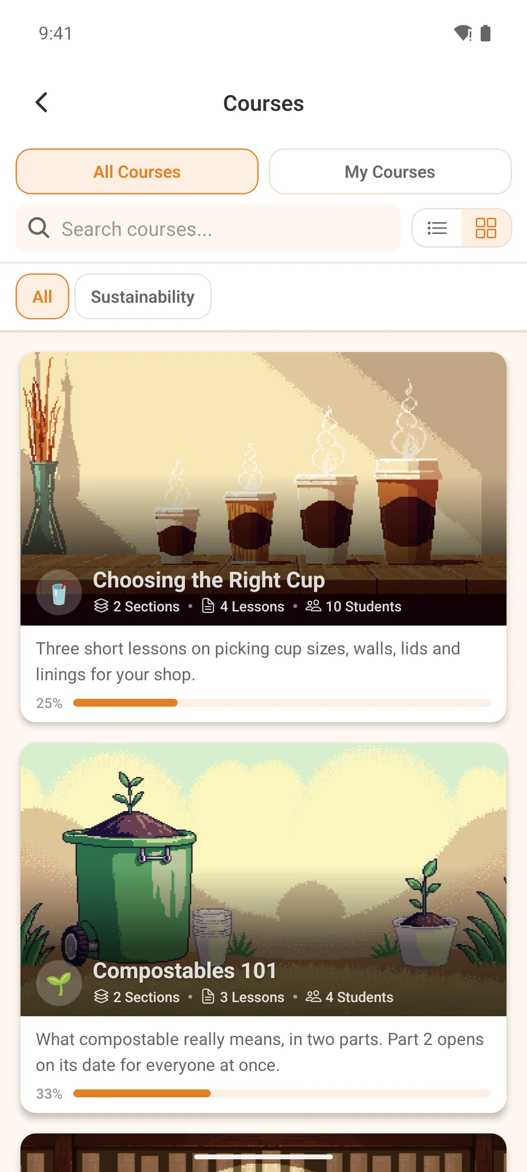
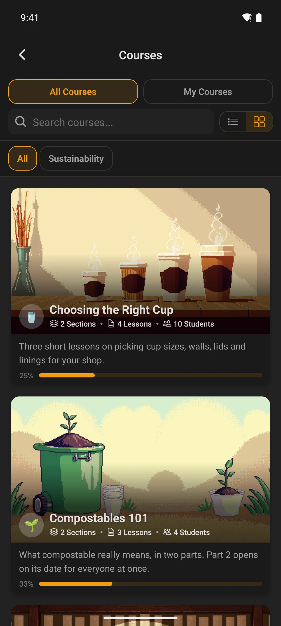
  • The Courses tab switches between cards and a list, the way Spaces already does — same control, same place beside the search bar. You choose which one members land on, and whether they can change it, in Customize → App Screens → Courses.
  • Tiles crop where you tell them to. A photo filling a tile always loses something, and cropping from the centre takes equal bites off the top and bottom — which is wrong for most photos people actually use, and turned a portrait into a beheading. You can now say which edge to keep. Tiles also tint themselves from their own artwork, and can carry a glyph.
  • Four tile widgets instead of one, and they all agree. Link Tiles is now a family — Tiles, List, Buttons and Chips — each its own widget, all built on one shared appearance contract. Set a corner radius or a colour rule once and it means the same thing in all four, which is what the old single widget's six layouts never quite managed. Picking a destination gained the same reach: point a tile at your content, a member, a web page or a screen in the app, from one picker.
  • Three more widgets to build a screen with — a Call to Action card, a Members widget, and a blockquote for pulling out a line worth reading twice.
  • A closed sign-up can hide itself, rather than explain itself. Closing registration used to mean one thing: a "Registration Closed" card at the end of the Sign up link. An App Store reviewer met that card, read "please try again later" as an outage, and rejected the build for a bug that didn't exist. Closed now has two shapes, and you pick per site. Hide drops the Sign up link from the login screen entirely and turns away anything that still reaches the sign-up route — no door is offered that can't open, which is what Fluent Community's own web login does. Message keeps the card, for a pause you mean to lift and want to explain. Hide is the new default, but nothing moves under an existing install: a site that took the trouble to write a closed message keeps showing it.

🛠 Fixed

  • Your Android listing no longer claims "Display over other apps". Expo's template ships SYSTEM_ALERT_WINDOW as an optional permission and nothing ever took it out, so every build advertised a permission the app has never used — on the Play listing, where people read them and draw conclusions. It's blocked now, with a guard so a future dependency can't quietly put it back.
  • Reading back through a chat no longer throws you to the bottom. Two separate lines caused the same complaint. Reacting to a message you'd scrolled up to jumped the list to the end, so leaving a second reaction meant scrolling all the way back — the "near the bottom" test was measuring in the wrong unit and read as true everywhere, so any change to the conversation scrolled it. And a message arriving from someone else scrolled you down unconditionally, so catching up on history in a busy conversation kept snatching you away from where you were reading. Only your own actions move the list now; following along when you're already at the bottom still happens, because that part is conditional.
  • Blocking someone stays blocked when you leave the chat. Block a member from a conversation and it took — the banner appeared, sends were refused. Walk away, come back through their profile, and the banner was gone while every send still failed on the server: the app said you weren't blocking them and then behaved as though you were. The profile's own Block button had its own version of the same problem, showing no blocked state at all after a reload, and reporting a refused block as nothing more than "Failed to block user". Both came of reading a field Fluent Community doesn't send while ignoring one it does.
  • Videos play again on hosts that check which site is asking. Bunny Stream, Wistia, SproutVideo and private Vimeo embeds decide whether to play by looking at the domain making the request, and the player was asking from a blank one — so they returned "can't be played from this domain" instead of the video. The same embed played fine on the website, which is exactly what made it look like a player bug rather than a domain one. Requests now carry your site's address, which is the domain those allowlists were set up for.
  • The delete-account confirmation keeps its buttons when the keyboard is up. The dialog caps at 90% of the screen and clips what doesn't fit, so with the keyboard open it sliced its bottom row in half — and on that particular dialog the bottom row is Cancel and Delete Forever. It reads as missing padding rather than a missing button, which is worse. The report dialog's reason list got the same treatment, so a long list can't push Submit off the bottom.
  • A notification takes you to the thing it's about. Tapping a comment, a mention or a course comment opened the profile of whoever triggered it rather than the post — so the one tap that should be the fastest way into a conversation was the slowest. The destinations were written against route names Fluent Community doesn't emit: six of the nine branches matched nothing at all, three names it really does send had no branch, and anything unmatched fell through to a profile. That fallback is why it never looked broken — every miss still landed somewhere plausible, and space posts happened to work, which made it read as random rather than wrong. The server decides the destination now, the same way Fluent Community's own notification list does.

🔧 Changed

  • Chat reactions work exactly like they do on the web, and look like it too. They're per-emoji toggles now: tap one to add it, tap it again to take it off, and hold as many as you like — which is what Fluent Community's own web client has always done, and what a member arriving from the web already had. The app used to allow one reaction each and then send a single toggle for a swap, so changing your reaction left the old emoji standing on the server: your phone showed the swap, the web showed both, and the next refresh sided with the web. Every route in — the smiley, the pill, the picker — now performs the same operation the server does, so the two can't disagree. The pills sit inside the message bubble and wrap onto a second line rather than running off the side of the screen, and reply, react and the message menu open on a long-press beside the bubble — both matched to the web client rather than approximating it.
  • The pull-to-refresh scenes are drawn, not painted. All ten ship no artwork now — they're generated as you pull, so they're sharp at any size, adapt to light and dark rather than being one fixed picture, and cost the app nothing to carry. Clockwork went from five flat images to an actual movement: meshed wheels turning at their real tooth ratios, a mainspring barrel and a ticking escapement. Spinner reads as molten on a dark theme and as saturated ink on a light one, which a single image can never do.
  • A Link Tiles widget you placed needs adding back once. The single widget with six layouts is replaced by the four above, which do everything it did and share one appearance contract rather than six near-copies. Because they're new widgets rather than renamed ones, an existing placement doesn't carry across: open Customize → Widget Screens and add the one you want from the "+". Nothing else on your screens is touched.

🖥 Dashboard & builds — if you build your own app

Ship: Needs a new build — seventeen packages moved, several carrying native code; build from the dashboard's Build tab.

  • Apply a core or module zip to the whole fleet, from one upload. The fleet could only fetch the published core, and only for apps sitting behind it — so a core repackaged without a version bump, which is what a dependency update or a rebuild produces, was invisible to the store and every app read as already up to date. The only way through was each app's own Updates tab, one at a time. Now one upload covers the fleet, and the zip says what it is: a core zip skips the is-it-behind and licence-key questions because the bytes are already in hand, and a module zip goes only to the apps that have that module.
  • The Play listing is fully dashboard-driven now. A Store Graphics card manages the two images the dashboard could never push — the 512×512 listing icon and the 1024×500 feature graphic. Neither slot rejects an image for being the wrong size: whatever you drop in is cropped and resized to the exact dimensions in the browser. There's a one-click derive from your app icon, and a banner generator that builds a feature graphic from your brand colour and logo, picking readable text automatically. Push writes both to every listing language, and they show up as compare rows checked against the hashes Play returns.
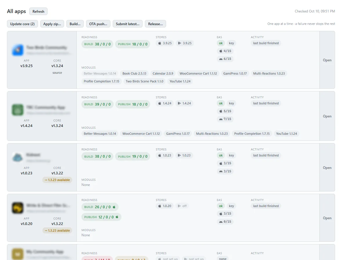
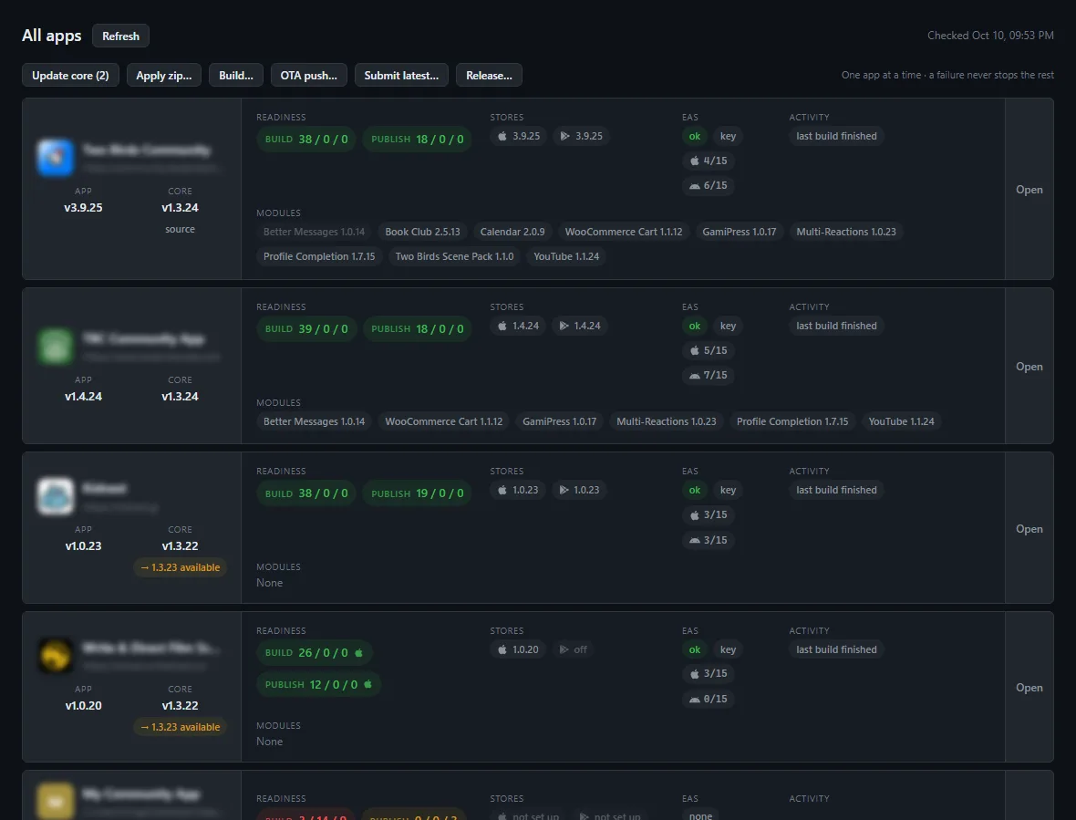
  • All apps on one screen, with five actions that run across them. If you look after more than one app, the switcher gains a fleet view: a row per app showing versions, whether it's ready to build and publish, what's live on each store, anything in flight, and the health of its EAS login — all refreshed in parallel, so one slow app can't hold up the rest. From there you can Build (with a per-app patch/minor/major bump), Submit the latest, push an OTA, Update core, or Release — the full Apple chain of locking a version, attaching the processed build, filling in What's New and submitting for review, plus a Play draft release. Every action shows exactly what each app will do before you confirm.
  • Your store release notes are written once, in the changelog. Each core version now carries a What's New block written for members rather than for you, and the Release action reads it straight out of each app's own changelog — so the text that reaches the App Store and Google Play is the text we wrote with the release, not something reconstructed months later against a 500-character limit.
  • One dashboard process now serves every app. Switching apps is a page change rather than a server restart, so it's immediate and nothing is lost in the swap. Underneath, each app carries its own context instead of sharing one global project path, and every eas-cli call goes through a single locked runner that owns the Expo session file — which is what makes it safe to work across several accounts at once. Store handling was re-checked against Apple's and Google's own documentation: a Play commit no longer cancels a review in progress or submits work you'd staged in the Console, the pipeline can't race its own edits or an EAS submission still running, and OTA republish and rollback do what they say.
  • A Publishing tab — the whole listing, and the release, from one place. Everything both stores ask for, collected in one screen instead of two consoles: names, descriptions, keywords, categories, support and marketing URLs, age rating, screenshots and release notes. It reads what's already live so you can see the current listing rather than guess at it, writes changes back, and drives the release itself. Apple and Google keep a single build list between them, so the version you're shipping means the same thing on both sides.
  • An App Review account, found or made, and put where it's needed. Apple requires working credentials for a reviewer to sign in with, and a community app is useless without an account. This finds a suitable one or creates it, then fills it into the review form — the step that most often sends a submission back.

📡 OTA & Internal

  • Fifteen Expo packages moved to their current SDK 57 patch levelsexpo itself 57.0.10 → 57.0.13, plus updates, router, notifications, image-picker, asset, constants, file-system, sharing, splash-screen, linking, image, media-library, build-properties and the dev client. All patch-level inside SDK 57: no migration, no API changes, nothing to adjust in your own modules. React Native stays at 0.86.2, which is the version SDK 57 pins — 0.87 exists upstream but moving to it would leave the SDK behind. There is no SDK 58 to move to yet; 58 is canary-only.
  • The two hand-managed native packages moved with them — Sentry 8.21.0 → 8.23.0 and the composer's keyboard controller 1.22.2 → 1.22.3. These sit outside Expo's dependency check on purpose, since its pins are compatibility floors and the check would drag them back down.
  • Bump your app version before you build. The update runtime is keyed to it, so building at the same number lets a later OTA reach a device still running the old native code.

1.3.9 — 2026-08-09

📱 What's New — store release notes

  • Your community can now arrange the app's tabs, menus and home screen, so what you see is laid out to suit your group.
  • Spaces now matches the website exactly, with courses on their own tab.
  • Names and titles containing an apostrophe no longer show raw code.
  • The message box in chat lines up properly on Android.

✨ New

  • Widget screens — build as many as you like, and put them wherever you want. The home screen used to be the only place a widget could live, in the only arrangement you got. Now you compose named screens — a "Community" sidebar, a staff dashboard, a getting-started page — each with its own widgets, order and audience rule, in Customize → Widget Screens. Point a menu item at one and it becomes a tab or a launcher tile, including the screen the app opens on. The same widget can appear on several screens, or twice on one, each placement with its own title and settings.
  • Content widgets — a widget screen is a page you write, not just a list of features. Six building blocks sit alongside the feature widgets: a heading, text with a real editor (bold, links, lists, tables, code), an image or full-width banner with an overlay title, a video or audio embed, an image gallery, and a spacer. They draw with no card around them, so a screen reads as one composed page — a welcome message above your courses, a banner over a menu of links — rather than a stack of boxes.
  • Link Tiles — your own menu, drawn as tiles. Build a tile menu pointing anywhere: a space, a course, a page of your website, an external link, another widget screen. Six layouts — tile grid, list, buttons, hero, featured mosaic, chips — so the same set of links can be a launcher-style grid on one screen and a row of chips on another.
  • Courses, Blog and Spaces are each one full-featured widget now. Every source works with every layout, independently: choose what's listed — everything, a topic, only what this member is enrolled in, or a hand-picked set — then choose how it looks: hero, carousel, list or tiles. Course progress renders in all four. Spaces gets a browsing widget for the first time.
  • Point a link at your content by picking it, not by typing its address. Menu rows, tiles and widget links can target a page, post, course or space chosen from a searchable list. The app resolves the target as it loads, so renaming the page keeps the link working, and one that's deleted or restricted quietly drops out instead of leaving a row that goes nowhere.
  • A visual "+" picker replaces the add-item form — one catalogue for every zone. Everything the app can put in a menu, drawn as tiles with the real glyphs and labels members will see: every built-in screen, every add-on's tiles, your widget screens, and the four things you author yourself — a page of your website, an app screen, an external link, a widget screen. You pick a destination by recognising it, not by remembering a route. Each tile says where that row already is, offers a Move here when it lives in another zone, and greys out anything switched off on your site.
  • Built-in menu items are yours to delete, and to bring back. Courses, Bookmarks, the directory — any built-in or add-on row now has a Remove, and removing one keeps your label, icon, colours and role rule so adding it back from the "+" restores it exactly. Plugin updates can't resurrect what you removed.
  • The icons along the top are a full section too. Messages, notifications and search were fixed in place; they're ordinary rows now, so you can reorder them, relabel them, restrict one by role, remove one outright, or move it down into the tab bar or the launcher. The avatar that opens the launcher is itself a row you can place or remove, and a dark-mode toggle joins the list of things you can put anywhere.
  • The strip across the top of the launcher is a section you fill yourself. It used to be a fixed gear and dark-mode switch. It's the quick actions zone now — three icon-only slots that ship empty. Drag Settings and Appearance back for exactly the old look, or put anything else there: any row works, badges included. Leave it empty and the strip doesn't render at all.
  • Sign out is a row like any other, so you choose where members find it. The launcher drew a Logout tile beneath the grid that no setting reached — not movable, not renamable, not removable, the last piece of the menu that wasn't yours. It's an ordinary row now. It starts exactly where that tile sat, so nothing looks different until you touch it; from there it drags into the tab bar, the top icons or the quick strip, takes your own label, icon and colours, and can be restricted by role like anything else. Remove it everywhere — for an app that signs out from Settings → Account only — and the builder tells you once that members will have no visible way out, then leaves the decision alone.
  • Five free tab slots — and a built-in in the bar is a real tab now. The old rule was three fixed core tabs plus at most two of your own; every slot is worth the same today, so five widget screens and no built-in at all is a valid bar. Courses, the directory, the blog, bookmarks, notifications and the leaderboard host as genuine tabs instead of throwing a full-screen page over the bar that launched them — the bar stays visible, the tab stays highlighted, and the app can open on it. Their search bars and filters scroll away with the content now. (Settings, Profile, Messages and Search stay full-screen pages — each has sub-navigation that needs a way back.)
  • A Community Menu widget — your website's sidebar, in the app. The same space groups your web portal shows down its left side, with their spaces, courses and custom links, their real icons and their unread counts, as a collapsible widget. Tapping a row lands on the native screen where the app has one. It’s the widget a “sidebar” screen is built around: put that screen first in the tab bar and the app opens on a navigator that mirrors the site. Two settings — start each group folded, and show or hide the unread badges.

🛠 Fixed

  • Names and titles with an apostrophe read properly again. WordPress escapes to the numeric form — an apostrophe comes back as &#039; — and the app's decoder only knew the named ones, so notification rows and card excerpts showed raw code like Jay&#039;s Space. Every entity is decoded now, named and numeric, through one decoder shared by the whole file. Fluent Community 2.7.7 widened the exposure by escaping space titles, role names and feed excerpts, so this shows up far more on 2.7.7 than before.
  • The password section obeys your site's Password Change setting. Fluent Community 2.7.7 added a real privacy setting for it and made the endpoint reject when it's off — so the app offered a password form whose Save could only ever fail. It reads the setting now. On 2.7.5 and 2.7.6, which have no such setting, nothing changes; your own feature toggle still sits in front of both, for SSO and social-login sites.
  • The chat composer sits level with its buttons. The input pill had no height of its own, so on Android it came out shorter than the icons beside it and read as sitting low in the row — reported twice. The pill and the buttons now share one control height, and the inline edit composer, which was a second hand-built copy of the same row with the same flaw, is the same component — so the footer no longer changes height when you edit a message.
  • The header and tab bar retract on a web tab, the way they do everywhere else. A tab pointed at a web page was the one full-screen tab where the chrome stayed frozen: a WebView does its own scrolling, so the controller that hides the header on every other tab was never handed anything to listen to. It retracts now, and the page grows into the space as it goes instead of leaving empty bands behind it — much like a mobile browser's address bar. Reaching the bottom of a page brings the chrome back, and a page barely taller than the screen keeps its bars rather than hiding them with nothing left to scroll.

🔧 Changed

  • Your Courses and Blog widgets need adding back once. The three narrower widgets — Course Catalog, Latest Blog Posts and My Courses — are replaced by the two full-featured ones above, which do everything all three did and combine any source with any layout. Because they're new widgets rather than renamed ones, an existing placement doesn't carry across: open Customize → Widget Screens and add Courses and Blog from the "+" once. Nothing is deleted behind you and no other widget is affected.
  • The Spaces tab matches your website exactly, and its display rules are a Customize page. It lists spaces the way Fluent Community's own discover page does — no courses mixed in, since a course lives on the Courses tab and in the Community Menu widget, which is where the web puts it. What the app adds is what the web has no setting for: the group headings, the cards/rows toggle and the remembered sort. Set them in Customize → Spaces, each with a members can change this switch. Turn one off and your choice wins for everyone, with the control hidden rather than sitting there not sticking — and nobody's saved preference is erased, so turning it back on restores it.
  • A newly activated add-on's widget waits in the picker instead of appearing on your home screen. A widget screen is a composition — the list on it is exactly what you put there — so activating a plugin that ships a widget adds it to the "+ Add widget" catalogue for you to place, rather than dropping it onto every screen you've built. Previously it turned up on the home screen uninvited. An install that has never edited its widget screens is unaffected: it still gets the full set out of the box.
  • Members' personal widget order resets once. Widget order is saved per screen now, since the same widget can sit in different places on two different screens — so the single old record can't be carried across. Every member's next visit starts from the order you set in the builder, and their next drag saves under the new per-screen record. One-time and cosmetic; nothing else about their app is touched.
  • The dark-mode row keeps its own sun/moon artwork. Its icon flips to show what tapping it will do, so a fixed icon of your choosing would state the wrong thing half the time — that one field is no longer editable. Its colour, background and bare-icon switches all still are, and every other row's icon is as free as it ever was.
  • You can lock a widget screen's order. Each screen carries a members can rearrange widgets in the app switch. Clear it and your arrangement is what everyone sees, with dragging turned off — the same rule the Spaces view and sort locks follow, including the good part: a member's own saved order is kept, not thrown away, so unlocking the screen puts everyone back exactly where they were.
  • The Home tab is gone — you build the bottom bar from scratch. It existed from before widget screens did, and its only job was hosting one, which any tab slot now does. So the bar ships empty and every slot is yours: point one at a widget screen and that is your home, or lead with Spaces, or a web page. An app with no tabs yet says so and points at Customize → Menus rather than opening on a blank screen. Your custom rows, add-on rows and every other built-in carry over untouched — only the Home row itself goes, and widget screens you have already built are unaffected.

🖥 Dashboard & builds — if you build your own app

Ship: OTA-safe — JS-only, push from the dashboard's OTA tab.

  • Store screenshots, made and uploaded from the dashboard. Branding Assets moves onto its own Assets tab and gains a Store Screenshots card: drop in raw captures, write a caption, and the dashboard renders finished App Store and Google Play screenshots at the exact dimensions each store demands, then uploads them with the credentials it already holds for eas submit. Nothing goes to a third party. Because the canvas is always the store's own size, a capture only has to be sharp rather than a specific resolution — wrong dimensions being the most common reason an upload is rejected. The device frame stays a fixed height and the caption shrinks to fit above it, so a set stays aligned however long the captions run.
  • The setup guide walks Apple's age-rating and privacy questionnaires. Two of the longest forms between a finished build and a live listing, answered question by question for this app's actual feature set — including the answers that change depending on which features you've switched on.
  • A community that lives under a real portal slug type-checks clean. Two tsc errors turned up in every project whose community sits at a path rather than the site root — the slug constant narrowed to its own literal, so TypeScript proved a sentinel comparison could never match and flagged it. The check was always right at runtime; only the type was too narrow. Apps that predate the fix heal themselves the next time the dashboard writes the slug.
  • Custom modules: a header icon is declared as menuItems, not headerIcons. Now that a registration can live in any zone, the field is named for what it does — and accessibilityLabel becomes defaultLabel with it. There is no fallback for the old spelling, so a module still using it registers nothing: rename both fields in your module.ts. Our own add-ons ship updated; only modules you wrote yourself need the edit.

📡 OTA & Internal

  • Widget rows carry a (pageId, instanceId) identity, which is what makes a widget repeatable; a row with no instanceId falls back to its id, so stored configurations and saved member orders carry over untouched. The three retired widget ids drop through the unknown-id path without destroying anything stored alongside them.
  • Add-on-facing widget APIs grew with the builder: chrome: false for widgets that draw without a card, the destination and items setting types, and the shared tile-appearance fragment. Documented in setup/docs/module-system.html and setup/docs/widget-system.html.
  • The widget grid was split from the screen that hosted it: one chrome-free renderer (components/widgets/WidgetPageRenderer.tsx) plus a per-surface host — the tab chrome in WidgetPageTabHost.tsx, the pushed chrome in app/widgets/[pageId].tsx. That is why a widget screen looks and reorders identically as a tab and as a pushed page.
  • Core screens that host as tabs are one component with a surface: 'page' | 'tab' prop, and the four numbers both surfaces need — top padding, the pull-to-refresh reveal window, the retract handler, and forcing the chrome back into view — come from hooks/useSurfaceChrome.ts. Six screens share one recipe rather than six near-copies of it. A route can leave components/navigation/coreTabRenderables.tsx at any time and simply push again, which is the graceful outcome, not a bug.
  • Widget-screen menu rows go over the wire as /widgets/<id> routes, which is what lets one row host in a tab slot and push from the launcher with no second mechanism.
  • The startup batch learned one more conditional path: options/menu-items is pre-warmed when a cached widget screen holds the Community Menu widget, so it paints from launch two onward without its own request.

1.3.8 — 2026-08-05

✨ New

  • Feed Links — the link row your web portal shows above the main feed, now in the app. Curate community-wide links and members see them on the feed exactly as they do on the web, managed from the same editor. It's a separate feature from Space Links, with its own storage and permissions, and both bars now share one editor and one row component — so the space side picked up the same polish rather than the two drifting as near-copies.
  • Sign-in, sign-up and password recovery are each styled and worded on their own. Every one now carries its own branding and its own copy — drop the site name from sign-up while sign-in keeps it, or write a heading for password recovery, which never had one. Customize → Login & Sign-up is three tabs, and picking one switches the preview and its settings together, so what you see is what you're editing. Defaults match what each screen has always drawn, so nothing moves until you touch it.
  • A web page in the tab bar behaves like a tab. Point a menu item at a URL and put it in the tab bar, and you used to get a full-screen page thrown over the bar it was launched from — and the app would never open on it, silently starting on the next tab instead. Anyone whose home tab is a hand-built HTML menu had no way to make it home. It's a real tab now, bar and all.
  • Open a post from its title or timestamp. In feed mode "show more" expands a post in place — which is correct, and matches the web card exactly — but it was the only thing you could tap, so it read as the wrong destination. The title and timestamp now open the post, the same two links the web portal gives you, and "show more" still expands inline.

🛠 Fixed

  • A reply now answers whoever it replied to. Fluent Community returns comments as one flat list in posting order and builds the thread from a parent id; the app rendered them in arrival order and used that id only to decide indentation. So answering an earlier comment after a later one had been posted put the reply at the bottom, visually attached to whatever happened to sit above it. A community hit it with two replies to two different members, both stacked under whoever had commented last — the thread said the wrong thing about who had answered whom.
  • A course assigned to a space group shows up in that group. In Fluent Community a course and a space are the same kind of record, and a group carries whatever sits under it — its own sidebar does exactly that. The app asked an endpoint that filters to spaces only, so an assigned course was dropped before the app ever saw it: present in its group on the web, missing from the same group here, leaving the home screen and the Courses tab as the only ways to reach it.
  • A welcome-banner video plays whatever it was built with. Fluent Community's banner editor offers Oembed or HTML Code, and the app accepted only the first — so a banner built with HTML Code rendered its title, its text and its close button with simply nothing where the video should be. No black frame, no poster, no hint anything was missing. HTML Code is exactly what you reach for when oEmbed can't help, which is every Bunny Stream, Presto Player, Vidalytics and Loom embed.
  • The chat composer stays above the keyboard. Opening a chat from a comment — tapping the author, then Message — left the input hidden underneath it, because that route reaches chat through a full-screen modal and the keyboard spacing was measured against the wrong origin. It's measured absolutely now, so every way into a chat behaves the same.
  • The first home widget has room under the header instead of its title sitting against the border.
  • A long poll option is readable. It was cut off after two lines, so options carrying their meaning in a trailing parenthetical lost it. The web wraps the full text; now so does the app.
  • Deep links now cover the whole community. Where a link to a member or a notification used to be the only kind that opened the app, tapping a space, a course, a lesson or a shared post now lands members exactly where it should — anywhere your site's address appears: an email, a text, another app. Copy link comes along with it: the address it hands out is now one the app recognises, so a post shared between members opens in the app rather than a browser. Matched against the URLs Fluent Community actually builds, verified on 2.0.0, 2.2.01 and 2.7.5.
  • A menu item set to open in the in-app browser stays in the in-app browser. Point one at another website and it was handed to the phone's browser instead — the opposite of the setting you chose, with nothing in WP Admin saying so. It stays in the app now. It loads signed-out, which is the only safe answer: a session is only ever minted for your own site, never a third party's.
  • Tapping a link back to your own site inside that browser opens the app screen for it. Those were never intercepted, so a link home loaded as a signed-out web page — which on a Fluent Community portal means being dumped on the public landing page. Interception is deliberately narrow: it only happens when there's a native screen to go to, or when the page is on your site but the browser has no session to lend it. Form submissions and back/forward are left alone, so nothing you were filling in gets thrown away.
  • Birthdays show the right day, and keep it through every save. The profile, the edit label and the picker each read a date differently, and the picker wrote its own wrong answer back — so every save walked the date another day into the past. All three agree now, which covers registration and profile completion too. Stored data was never wrong, but a birthday already dragged backwards needs setting once more.

🖥 Dashboard & builds — if you build your own app

Ship: Needs a new build — the Android deep-link paths in app.config.ts changed; build from the dashboard's Build tab.

🛠 Fixed
  • Switching apps can't cost you an EAS login. The dashboard treated the presence of Expo's state file as proof you were signed in — but EAS CLI rewrites that file to an empty shell on logout, and recreates it that way during an app switch. Saving one of those over an app's stored session wiped a good login, turning the next switch back into a full browser re-auth. It now checks for an actual session before saving.
  • A white app icon is visible in the device preview. The icon previews drew straight onto the modal's own surface, so a white or near-white icon had no edge at all — the one icon that most needs checking was the one you couldn't see. Both the Android and iOS renderers now sit on a mock home-screen wallpaper with a light/dark toggle, under a launcher-style shadow that gives the silhouette an outline at either extreme.
  • You run exactly the dependency versions we tested. Core used to ship version ranges, so what you got depended on the day you installed — two projects on the same core could end up on different versions, and a bug could reproduce on one and not the other. Everything in the snapshot is pinned now. Need a newer version sooner? Set it in your own package.json and it survives future core updates.
  • Android needs the rebuild for deep links; iOS doesn't. The two halves live in different places: Android's claimed paths are compiled into the app from app.config.ts, so they only change on a build. iOS reads its list from the apple-app-site-association file your site serves, which the companion plugin generates — so updating the plugin fixes iOS on its own, with no app release at all.

📡 OTA & Internal

  • Six Expo packages moved to their SDK 57 patch levelsexpo 57.0.10, expo-updates 57.0.12, plus router, linking, constants and image. All patch-level: no migration, nothing to adjust in your own modules. The one worth knowing is an iOS crash fix in expo-updates — purging its log could abort the app outright, on the path the OTA restart check runs.
  • The claimed deep-link paths live in three places — the app's mapper, the Android intent filters, the plugin's AASA — and the reasoning for them now sits in exactly one (matchRoute() in utils/deepLinkMapper.ts), with the others pointing at it. Copies of an argument drift into different stories, which is how the wrong paths survived this long. The dead branches were deleted rather than kept as a fallback; a branch for a URL that never existed only convinces the next reader it must matter.
  • Android path claims split into prefix and exact matches. pathPrefix swallows the whole subtree, so a terminal surface like /courses would have claimed /courses-for-beginners too. A path claimed here that the mapper can't route is worse than not claiming it — the OS opens the app and the app has nowhere to put the member.
  • Camera and microphone auto-grant is withdrawn on unauthenticated in-app browser shells, now that pages from other sites can load there.
  • parseDateOnly() reads a date-only string as local midnight while real timestamps pass through untouched, and toDate() routes through it — so every formatter is calendar-correct by default instead of per-caller opt-in. It rejects two things the ISO parser used to absorb for free: a two-digit year (the multi-arg Date constructor maps 0087 into 1987) and out-of-range parts rolling over, which turned the MySQL zero-date 0000-00-00 into November 1899 and would have handed the picker a real-looking value. Both fall through to the existing guards now.

1.3.7 — 2026-08-01

✨ New

  • Greek — Ελληνικά. A third language alongside English and Spanish, and a complete one: all 1,251 app strings, every bundled module, and the server side too, so REST errors, push notification bodies and the Customize island come through in Greek instead of dropping back to English mid-screen. Written in an informal modern register, with proper Greek question marks. Members pick it in Settings → Language.
  • The Courses widget has layouts. My Courses can stay the sideways rail it's always been, or become a compact list, or a hero card that picks up whatever the member is partway through — with latest and random as alternatives to continue-learning. Home screens you've already arranged keep the rail and don't move.
  • A Course Catalog widget, for communities that sell or promote courses. Where My Courses shows what a member is enrolled in, this shows what's on offer: auto-colored topic tiles that open the course list already filtered, a cover grid, a showcase carousel, or a single featured course. Any layout can be narrowed to particular topics. It hides itself until the site actually has course topics, so it can't render as an empty box.

🖥 Dashboard & builds — if you build your own app

Ship: Needs a new build — React Native 0.86.2 and a Hermes bump; build from the dashboard's Build tab.

✨ New
  • Your Apple settings live with the project now. Team ID, Team Type, APNs Key ID and build presets moved into <project>/setup/.app-prefs.json. They used to sit in the dashboard's own folder keyed by app slug, so the same app answered differently depending on which project you happened to launch the server from, and a snapshot import that rewrote the slug moved the key mid-session. Existing values migrate on first boot. The file is gitignored, so putting your project under version control doesn't commit your Apple Team ID along with it. Theme and redacted mode stay with the operator rather than the app, and your Expo session token doesn't move at all — a live token has no business in a folder that gets zipped and emailed.
  • A swapped .p8 is caught by its filename. Apple names both the APNs key and the App Store Connect key AuthKey_<KeyID>.p8, and the bytes can't tell them apart — they're both EC P-256 keys — so the filename carries the only distinguishing fact there is. Uploading one now reads its Key ID and fills the field for you, which removes the manual copy that causes the swap in the first place.
  • The dashboard tells you when a core or module update is out. FluentCart serves exactly one file per product — the WordPress plugin — so the dashboard had no route to the app module or core zips, and no way to even know a release existed. You'd push an OTA and never learn a core update had been waiting for weeks. Every card now checks a public release catalog in a single request, however many modules you have installed, and an Update button trades that product's license key for a short-lived download link. Knowing costs nothing; downloading proves entitlement. Offline keeps the last catalog rather than blanking every badge.
  • Your license keys have somewhere to live. They sit beside the App Store Connect and APNs keys and ride the identity snapshot with them, so a rebuild or a new machine doesn't mean hunting them down again. Save Key verifies against the license server read-only — no activation is consumed just by checking — and the card shows licensed state and expiry. Nothing in the dashboard is gated behind a license: if one lapses you carry on building, configuring and shipping exactly as before, and the only thing that stops is new versions arriving.
  • Choose which Expo account a new project lands in. A New project under selector sits in the picker's footer, listing every account your login can create in and pre-selecting the one that matches this app. Without it, a login with access to more than one account made eas init fall back to its default personal account rather than the client's organisation — with nothing on screen to say so. Where no account matches unambiguously the button stays disabled until you choose one.
🔧 Changed
  • One App Store Connect key now does everything Apple asks for — no Apple ID, no password, no 2FA code to go and fetch. The same key handles signing credentials and submission, so a build or a submit runs start to finish unattended, and one machine can work across several clients' Apple accounts without logging in and out of anything. This is also why appleId has left eas.json and the packager no longer writes a placeholder for it: an Apple ID or a stray app-specific password sitting in the environment silently outranks the key and sends eas-cli down the old path, so the only reliable way to keep the key working is to leave it nothing to lose to. The check that clears them runs from one shared definition across both build and submit.
  • The Publish walkthrough is a checklist, not a replica. It used to mirror App Store Connect's whole page — fake app bar, mock form widgets, replica inputs — which was a lot of furniture to read past. It keeps Apple's sidebar, since that's the part you actually navigate by, and replaces each page body with one row per field in Apple's own order, including skip rows for entries that don't apply so nothing looks accidentally missed.
  • The store answers we'd been deciding case by case are settled and written down. Content Rights is yes, since the app shows member content and opens member links. The Apple Standard licence agreement is enough — guideline 1.2 wants report and block, and both ship. Age ratings answer user-generated content and social media yes, and Unrestricted Web Access no: off-site links leave the app, so guessing yes raises your rating for nothing.
  • The setup guide covers one Apple path instead of two. The Apple-ID migration steps moved out of it and into a dashboard banner that carries the sunset date — so if you're still on an Apple ID the dashboard tells you directly, with the deadline, at the moment it matters, and everyone else stops reading past instructions for a path they were never on.
🛠 Fixed
  • Deactivating a module no longer half-uninstalls it. Deactivate deleted the module's route files out of app/, while Activate only put the registry entry back — and those files were hand-written, existing nowhere else. So switching a module off and on again left it registered with no screens behind it: its pages 404'd, and exporting it failed on files that no longer existed. You couldn't package a module you'd simply turned off, which is the normal state for one you sell but don't run yourself. Route files are generated now, from a route → screen map in the module's manifest — activate writes them, deactivate removes them, re-activating restores them byte-identically. Off means off rather than gone.
  • Updating a module you'd deliberately switched off no longer switches it back on. Import re-activated unconditionally, which also affected Upload Update.
  • A snapshot import can no longer report success on a write that failed. Restore ran through two writers — one knew the project paths, the other knew which app was selected — so the first handed values back for a second write that could fail quietly behind a green UI. That is exactly what happened on a client import. One writer owns the whole restore now.
  • Three wrong claims in the Publish guide, found by checking every assertion it makes about our own config against the config: the Export Compliance prompt doesn't appear at all (app.json answers it), the build picker's numbering explanation described builds a buyer wouldn't have, and two notes cited evidence from a client audit that means nothing to the reader.
  • App Store screenshots are one set, not one per size — and the slot to fill is the topmost one, labelled by pixel size rather than a device name.
  • An eas.json with a blank value repairs itself at boot. EAS validates the whole file before it does anything and rejects an empty string outright, so one blank value broke every eas-cli call — build, submit, build list, even eas init — with an error that names the field but reads like the file is corrupt. Dashboards before last month's fix wrote the Staging URL into the development profile, so any project whose buyer left staging blank has been carrying a poisoned file that retrying couldn't fix. The site URL is restored per profile from app.config.ts, and only the development profile falls back to staging — healing the others with it would quietly point real builds at your staging site.
  • A failed re-link puts app.json back. Re-linking has to clear owner and project id first, since eas init treats an existing project id as already linked — so an init that failed left the project with no owner, no project id and no updates URL. The old values are restored now if it doesn't finish.
  • OTA and build commands work on a project with no git. EAS_NO_VCS=1 doesn't actually stop eas-cli running git rev-parse — and when that fails it prints the error and its own advice to stdout, ahead of the payload, so --json output stops being JSON. Every command that parses JSON was affected on a git-less project, which is a setup we document as fully supported, and it degraded quietly rather than erroring: an OTA push lost the runtime version, group ID and platform list the dashboard shows, and a started build lost its queued ID. Setting EAS_PROJECT_ROOT skips the git lookup entirely.
  • A failed eas-cli call says why. eas-cli puts the real reason on stdout and only a generic <command> command failed. trailer on stderr, and the dashboard was reporting stderr alone — so every OTA operation failed with no cause attached. Both streams are reported now.
  • eas init no longer stalls on a git-less project. It was the one eas-cli spawn missing the no-VCS guard its siblings had, so it could offer to run git init with no terminal to answer the prompt.
  • A placeholder owner no longer reads as "linked" in the create-project confirmation, which had been deriving that state separately from the panel it sits on.

📡 OTA & Internal

  • Dependencies synced to Expo's SDK 57 set — this is why 1.3.7 needs a build rather than an OTA push. Fourteen packages moved to the versions Expo expects, including React Native 0.86.2, Reanimated 4.5.1, Worklets 0.10.1, expo 57.0.9 and expo-updates 57.0.11. All are patch-level inside SDK 57 — no migration, no API changes, nothing to adjust in your own modules — but React Native carries native code and bumps the Hermes engine, so it only lands on a rebuild. (React Native 0.86.1 doesn't exist; it was pulled upstream over a publishing problem.) Bump your app version before you build: the update runtime is keyed to it, so building at the same number lets a later OTA reach a device still running the old native code.
  • The two hand-managed native packages moved up too — Sentry 8.20.0 → 8.21.0 and the composer's rich-text editor 1.0.1 → 1.1.0. These sit outside Expo's dependency check deliberately, since its pins are compatibility floors and the check would drag them back down. Sentry adds TurboModule attribution to native crash reports; the editor fixes Android's initial height measurement, iOS inline-style merging with plain text, and a normalizer that was stripping <br> inside blockquotes. Its autoFocus prop now defaults to false, which changes nothing here — the composer focuses the editor itself once the sheet settles, so the keyboard rises reliably on both platforms.
  • tManifest is served from the I18n context now, like t and tModule already were. It resolves the display strings that come from a manifest or registry — home-widget titles, profile-tab titles, refresh-scene names — and it was the one translator door left unwired from React. Because its identity never changed, any component memoizing its output had to hand-wire locale into a dependency array and silence the linter; three call sites had done that three different ways, and one of them only passed the linter by coincidence. useI18n() now hands back a locale-bound copy, so a memo depends on the function it actually calls. Module authors: take tManifest from useI18n() rather than importing it from i18n/i18n inside a component — the direct import still exists and is still correct for non-React code.
  • npm run lint is back to zero — no errors, no warnings. A newer eslint-config-expo brings the react-hooks/refs rule, which flags the pull-to-refresh gesture for handing a ref-reading callback to onFinalize in the render body; the callback is stored rather than called, since gesture-handler runs it as a worklet, so it's suppressed at that one line with the reasoning beside it. The nine warnings that had been riding along since 1.3.3 went with it: seven dead destructured bindings left over when RefreshableScroll took ownership of refresh state, and one Array<T>. The ninth went with the tManifest change above: the settings screen's scene-label memo used to depend on t as a stand-in, because the old tManifest read the locale off a non-React singleton no linter could see. Now that useI18n() returns a locale-bound copy, the memo depends on tManifest itself — the function it actually calls — and the warning resolves on its own.
  • Module authors: routes is now a route → screen map. routes: { 'shop': 'screens/ShopScreen' } replaces routes: ['shop'], and files under app/ are generated from it — stop hand-writing them, and treat anything already there as output. Because a generated stub can only be a one-line re-export, page chrome moves into the module: add a second screen component where one screen mounts both wrapped and bare, as modules/calendar/screens/CalendarPushedScreen.tsx now does for its tab slot. The array form still behaves exactly as it always has, so a module already installed on a buyer's site is untouched until its author opts in.
  • setup/lib/store-updates.js is the only thing that talks to the store, and it resolves rather than throws when the network is down — so the timeout, the offline behaviour and the opt-out are decided in one place instead of drifting across callers.
  • The dashboard states each eas-cli quirk once rather than per caller: easFailureMessage() replaces three copies of the combine-both-streams workaround, and readAppConfigUrls() holds the one contract with app.config.ts's literal format. No behavior change.
  • The courses screen accepts ?topic= and ?tab=enrolled, so the new catalog tiles deep-link into a pre-filtered list. Both are array-safe and seed the existing chip bar and tab toggle rather than adding parallel state.
  • Course and blog layouts share their extractions — ColorTiles (was BlogTermTiles), CourseRail / CourseHeroCard / CourseCompactList / CourseGrid / CourseProgressRow, spotlightCardStyles, compactListStyles and useMeasuredGrid — so a fix to one layout family reaches both.
  • Changelogs now separate dashboard work from app work. Everything only a self-building buyer can act on — dashboard, EAS, signing, submission, packaging — sits under its own heading together with the Ship line, so a managed operator can read the top of an entry and stop. Applied back through every release.
  • Greek is registered in i18n/i18n.ts and SUPPORTED_LANGUAGES, so it survives core updates. Adding a fourth language still means editing that core file yourself and re-applying it after each update — the recipe is in setup/docs/i18n-system.html.

1.3.6 — 2026-07-28

✨ New

  • Hold members on a minimum version per platform. The store gate used one minimum for both platforms, so raising it the day Google approved a release locked every iOS member behind a build Apple hadn't published yet. iOS and Android now take optional overrides on top of the shared value, so you can gate one platform without touching the other.
  • A one-tap restart when an update is already downloaded. Separately opt-in: when a fix has finished downloading in the background, members get a restart screen instead of waiting for their next cold start. It can only appear once a download has actually succeeded, so being offline, having no update for that build, or a rolled-back release all leave it hidden — nobody gets stranded on it. Checks run on launch and when the app comes back to the foreground, throttled to once every five minutes. The two gates are independent, so arming the restart doesn't drag a store update along with it.

🔧 Changed

  • The login logo and background are Customize-only now. Both were bundled image slots with Dynamic/Static toggles that predated the Customizer. They're site branding fetched at runtime, and leaving one unset simply renders nothing instead of needing a placeholder file in the build. The dashboard's two asset slots and their toggles are gone, and each branding color moved onto the asset card it actually affects.
  • Space groups collapse in the search scope picker, matching the Spaces tab, the messages inbox and the composer's space picker — the last list still rendering static headers. Collapse resets when you close the sheet or pick a space, and typing a filter overrides it, so a match can never hide inside a collapsed group.

🛠 Fixed

  • Real-time events with no payload stopped throwing. Fluent Community's socket omits the data object on subscription-succeeded where Pusher sends an empty one, and the difference was enough to error.
  • A post's 3-dot menu works again. Every row — Edit, Delete, Report, Disable comments, Copy link, Pin — did nothing when tapped, on every feed, with no error to hint at why. Reported against Edit; it was all of them, and it had been broken since late June. Reviewing the fix turned up two more, both closed: a chosen action could stay armed after a dismiss that reported nothing and then fire on the next menu you opened (reachable on tablet — pick Delete on one post, open another menu while the first is still sliding out, dismiss it by tapping the backdrop, and the first post gets deleted), and a second tap landing on the still-animating list could replace the row you actually chose. First tap wins now.
  • Confirmation dialogs on menu actions are no longer fired into a closing sheet — leaving a space, removing someone from a group, blocking a member, deactivating an account. On iOS that's the hazard that leaves a sheet latched shut.

🖥 Dashboard & builds — if you build your own app

Ship: OTA-safe — JS-only, push from the dashboard's OTA tab.

✨ New
  • An optional dark splash image. A monochrome logo that reads fine on a white splash disappears on a dark one. The dashboard gains a splash_screen_img_dark.png slot — genuinely optional, so leaving it unset is a valid state that reads "light image used for both" rather than a missing-file error. It's captured in your identity snapshot, so a core update can't quietly reset the dark splash back to the light image.
  • Apple work no longer asks for an Apple ID. Registering identifiers, creating signing credentials and submitting builds all went through an interactive Apple ID, password and 2FA prompt. That can't work on someone else's account — you don't have their login, and on an Individual enrollment an invited admin gets no developer-portal access at all. Every Apple operation now authenticates with an App Store Connect API key instead, proven end-to-end on a real client account: identifier, distribution certificate and provisioning profile all created with zero Apple ID prompts. The dashboard gains Apple Team ID and Team Type fields, and an iOS Credentials block that hands you the whole pre-filled command to paste.
  • Somewhere to keep your push delivery credentials. The APNs key and the FCM V1 service account both get a slot in the Push Notifications card — upload, download, delete, status, and a link straight to this project's EAS credentials page. Apple lets you download an APNs key exactly once and neither file is referenced by the project, so there was previously no record you'd done it and no copy to fall back on. This is storage, not delivery: the upload to EAS still has to happen, which the card says plainly.
  • See your build allowance before you hit it. The dashboard's Builds tab shows per-platform meters, the pooled total and how many days are left in the cycle. On the Free plan that's 15 iOS and 15 Android builds a cycle, and the first sign of the ceiling used to be a refused build with no warning. It's the per-platform number that stops a build, not the pooled one — you can be refused an Android build at 15/15 while the total still reads 26/30 — so the meters and the warning follow that, and paid plans render their own allowance. It reads the project's owner rather than your login, since an org-owned project bills to the org's plan. If the lookup fails the strip simply hides instead of getting in the way of a build.
🔧 Changed
  • Build validation blocks per platform. An asset defect on one platform used to disable builds for both; an iOS problem no longer stops you shipping Android.
  • App Store Submission split into Apple and Google cards. The two stores share nothing but the file they write to, and they get set up weeks apart — Apple gated on enrollment and an API key, Google on a signup and a service account. One card with subheadings made a long scroll where an Android field read as an Apple one. A Play warning now scrolls to the Play card rather than the top of Apple's.
  • Branding Assets moved into Config, and the separate Assets tab is gone. The save bar sits outside the tabs, since unsaved work can span config and staged uploads and a tab-scoped bar could vanish mid-edit.
  • The generated commands match your shell. They were PowerShell-only, which broke on line two for anyone on macOS or Linux. The dashboard emits PowerShell or POSIX based on the machine it's running on, degrading to POSIX if it can't tell.
  • The Splash Background (Dark) help text now says it follows the phone's system dark mode rather than the in-app theme. The splash is drawn natively before any JavaScript runs, so the in-app toggle can't reach it.
🛠 Fixed
  • White-labeled apps build again. Every white-label snapshot failed to bundle with "Unable to resolve @/assets/images/login_background_img.png" — the config required that image unconditionally while the packager stripped it out of every snapshot, and the dashboard reported the slot as satisfied the whole time. With the login background now fetched at runtime there's no bundled file to go missing.
  • A blank Staging URL no longer breaks every build command. Leaving it empty wrote an empty environment variable into the config, which invalidated eas.json and made every eas-cli call fail.
  • Branding assets are checked, not just labelled. The Assets card used to print the recommended size next to the file size, which reads as though the file had been inspected. It hadn't — so an opaque 1024×1024 image could sit in the Android notification-icon slot showing "96×96" indefinitely. Android masks that slot by transparency and ignores color entirely, so an opaque source renders as a solid block. PNGs are now read for their real dimensions and alpha, and anything unreadable is reported as unknown rather than guessed at.
  • Clearing a submit field empties it properly. Blanking one wrote an empty string, which fails EAS's own schema validation; the key is removed now.
  • The save bar stops lying on a credentials-only save. Saving nothing but preferences, or only a removal, reported "No changes to save" after having written them, and left the bar stuck dirty until a reload.
  • A legacy Apple ID no longer shows through redacted mode on the Snapshot tab — it had been dropped from the sensitive-keys list while still being rendered.
  • Importing a snapshot refreshes what's on screen, so restored team values appear immediately instead of staying invisible until a reload.
  • A blank value in a snapshot can't wipe a good one. The five iOS submit keys used to travel two restore paths with different meanings for the same input; through an import, "empty" means the snapshot didn't carry it, not that you cleared it. They take one path now, and the safe direction won.
  • An APNs Key ID that's really the App Store Connect Key ID is caught. Apple issues two different keys whose IDs are indistinguishable — both exactly ten uppercase alphanumerics, both arriving in byte-identical .p8 files — so pasting one into the other's field passed every check and produced no symptom until iOS pushes silently never arrived.
  • The push-credential warnings stopped implying push is broken. Those two checks look for a local copy of the APNs key and FCM service account; what actually delivers a push is the upload to EAS, and there's no way to ask EAS whether that's been done. The old wording asserted iOS and Android pushes were failing — so every existing project would have updated into a dashboard claiming push was down while it carried on working fine. An empty slot now reads as "no local copy", which is what it means.
  • The APNs walkthrough matches Apple's actual screens. The Configure step was documented as optional when it's required, and its default is the wrong choice — following the old text produced a key that doesn't work. The guide now mirrors the real Register a New Key flow, names the three fields in Expo's dialog, covers the screens it used to skip, and explains that losing the one-time download isn't a dead end since you can register a second key. Verifying push now points at the built-in test rather than a hand-run curl.
  • The dashboard's dark-splash staging no longer wedges on a failed save. A retry after a failed config write could read as "no change" and silently drop the setting — leaving the uploaded image on disk and the tile green while the config still pointed at the light image. Removing a file that had only been staged, never saved, also left Save stuck enabled and erroring until a reload.
  • Transparent branding assets are actually visible as transparent. Image thumbnails on the Assets card sit on a checkerboard now. Against a flat fill, "transparent" and "solid white" look identical — which is how a notification icon with a solid background shipped unnoticed. The checker stays mid-grey in both light and dark mode, since these assets are mostly white glyphs that vanish on a light background and a transparency indicator shouldn't track the theme anyway.

📡 OTA & Internal

  • /app-config ships every platform's minimum version and the app picks its own, since the endpoint is public and a page cache could otherwise serve one platform's answer to the other. The X-TBC-Min-App-Version header carries the highest configured version as a wake-up signal, deduped per value so the un-gated platform doesn't refetch config on every response.
  • Optional branding assets are data-driven off the asset registry, so adding a second one is an entry rather than new code. Removal is staged like any other asset edit and the file is deleted only after app.json no longer references it — the reverse order would leave a build pointing at a file that's already gone if the config write failed.
  • Sheet-menu action sequencing lives in one usePendingSheetAction() hook, shared by SheetMenu and the action-sheet host, which had a line-for-line copy of the mechanism and both of its bugs. The action is stashed synchronously, the sheet closes, and the action runs once it's fully gone. Module authors: a menu row carries its real handler now — don't defer it yourself.
  • fcm-v1-service-account.json is ignored by both git and EAS. It's a private key, and the existing rules ignore the Play key by exact name with nothing matching .json by extension — so without its own entry in both files it would have been committable and shipped inside build archives.
  • Three Google JSON files now sit at the project root and none are interchangeable: google-services.json ships inside the app so a device can obtain a token, fcm-v1-service-account.json is uploaded to EAS so pushes can be delivered, and google-play-service-account.json is read by submit to upload to Play. Two are service account keys, so the card, the guide and the path definitions all spell out the split.
  • EXPO_APPLE_PASSWORD and EXPO_APPLE_APP_SPECIFIC_PASSWORD are cleared from a build spawn only when the project is actually on the key path — either one would otherwise silently defeat key authentication from the operator's shell, since the first forces the interactive path and the second outranks the API key on submit. Scrubbing them unconditionally would have broken a project still using the Apple-ID flow, where that variable may be the working credential and our own guide once recommended it.

1.3.5 — 2026-07-27

✨ New

  • Schedule a post. Pick a future date and time when writing a post, and preview it as it will appear before it goes out. A Scheduled Posts screen lists what's queued — the only place to see them, since Fluent Community's feed never returns scheduled posts. Times use your site's clock, so "Sunday 9am" means the same for everyone. Available to moderators and admins, matching Fluent Community's own rule; requires Fluent Community Pro.
  • Separate colors for the top bar and the bottom tab bar. Customize now edits the app's own 21 color tokens, grouped by surface: Content, Accent, Top navigation and Bottom navigation. Sites synced to Fluent Community look exactly as they do today — the two bars only come apart if you choose to pull them apart. Fields you haven't set show the color they inherit.
  • A settings gear in the launcher. An optional shortcut on the launcher's profile row, next to the light/dark toggle. Show both, either, or neither. On by default.
  • Two more animated hero scenes — a cherry blossom tree and an aquarium — added to the existing set. They're also a decent illustration of what a custom scene can be: your own branded artwork, a full-color illustration, or one tinted to your theme colors.
  • Lessons and posts render the blocks the app was dropping. Fluent Community 2.7.5 added Details and Math to the lesson editor, and the app showed neither — along with audio, video, embeds and SVG icons — with no error and no gap, because the renderer discarded those tags' contents outright. Now: Details is a real collapsible you tap to open; Math shows the author's original expression (React Native has no formula engine, so it's the source rather than a typeset formula, which is at least exact and legible); audio and video play inline; YouTube and Vimeo embeds get real players and anything else embedded becomes a tappable card; and a social-links block draws its icons. Headings four to six, horizontal rules and citations are styled too.

🛠 Fixed

  • Member search now says when it isn't permitted. Fluent Messaging 2.7.5 added a permission check on member search. Where a member isn't allowed to search, the app says so instead of showing an empty result, and hides the search box. An expired login is still treated as an expired login.
  • Messaging someone you're not permitted to message explains itself, rather than opening a composer whose first send would fail.
  • Chat images on external storage load again. Fluent Messaging 2.7.5 began encoding media URLs, which broke any address carrying a query string — signed S3 or R2 links, CDNs, image optimisers. Sites using local uploads were unaffected. Space icons had the same problem.
  • A photo-only message shows a photo in the inbox instead of a blank row.
  • Avatar initials are readable on the fallback avatar, and the header and launcher now show initials rather than a generic silhouette.
  • Tablet side panels handle the keyboard, so a focused input or submit button can't end up underneath it.
  • Transparent theme colors are correct on palettes that aren't six-digit hex — previously those could render the wrong tint.
  • Translations added for the notification swipe action, its accessibility label, and the fallback name for an unknown actor. Profile dates follow the app's language instead of US formatting.
  • Module errors are reported in production, not just in development.
  • Pickers opened from the composer no longer hide under the keyboard. Choosing a space, GIF, video or poll while the post body had focus opened the picker behind the keyboard, because the body editor is a custom native input that the standard dismiss doesn't reach. Every sheet opened from the composer now dismisses the keyboard first.
  • Rows inside a sheet scroll sideways again. The composer's topic chips, its formatting toolbar and the media preview strip had all stopped scrolling — the sheet's own drag gesture engaged on a small movement in any direction and swallowed the swipe before the row saw it. The drag is now vertical-only, so sideways swipes reach the row and swipe-down-to-dismiss behaves exactly as before. This affected every sheet in the app, not just the composer.
  • The scroll-to-top button lines up with the post button. Both sit on the same right-hand inset, but the smaller disc sat a few pixels off-centre above it. They share one size now, so they can't drift apart again.

🔧 Changed

  • Sheets opened from the composer are all the same height, so stacking one on another doesn't jolt — the GIF picker comes down from 75% to match everything else.
  • Three messaging sheets open as a side panel on tablets, and fourteen screens moved onto the shared screen wrapper for consistent safe-area and scroll behavior.
  • Text and icons over photos use the shared readability tokens, so they hold up in both light and dark.

🖥 Dashboard & builds — if you build your own app

Ship: OTA-safe — JS-only, push from the dashboard's OTA tab.

📡 OTA & Internal

  • An audit of ~250 component files and the consolidation it called for: MenuRows, GateScreen, ListStates, UserListRow, SettingsSection, AnchoredEmojiPopover, HeroCover, HeroCard, AttachmentPreviewCard and utils/coverImage each replaced two to five near-identical copies. ProgressBar moved to components/common/. Net −900 lines, no dependency or native changes.
  • The member-search protocol lives in hooks/useMemberSearch.ts instead of being duplicated across the new-message screen and the multi-select picker.
  • utils/siteTime handles site-timezone conversion and utils/feedPayload holds the shared create-post body, so the composer, scheduler and preview can't drift apart.
  • Colors arrive as app-native tokens, version-gated so a future shape change can't break an older build, with the Fluent-shaped data still sent alongside — theming survives an app and plugin being updated out of step in either direction.
  • Sheet primitives gained a headerRight slot, and Screen gained onLayout and side insets.

Dev Bundle · full source · lifetime licence

The complete source to a native community app for Fluent Community.

Real React Native (Expo), not a webview wrapper — white-labeled to your brand and shipped to both stores under your own name and accounts. Your code, your app.

100%of the React Native codebase — yours to read, modify and extend
2stores from one codebase, on your own developer accounts
buy once. No per-member fees, nobody able to switch your app off
0terminal. Builds, submissions and OTA updates run from a browser

Three parts · one bundle

The app, the WordPress side, the dashboard.

Click a tab. Every capture opens full size. Deeper pages: The App, The Plugin, The Dashboard.

Dev Bundle › What’s inside
Choose a view

What members install

Native screens, not a website in a costume

Feeds, spaces, courses, messaging, profiles and push, in light and dark. Every screen below is a real capture from the demo app.

The app home screen, built from widgetsThe app home screen, built from widgets
Home, built from widgets you arrange.
The activity feed on a phoneThe activity feed on a phone
Feeds, posts and comments.
The course list on a phoneThe course list on a phone
Courses and progress.
The launcher menu on a phoneThe launcher menu on a phone
Everything that is not a tab.

Where you shape it

Change the app while watching it change

Menus, widgets, whole screens and the theme are arranged in WordPress and drawn on a live phone as you edit. What you save reaches members the next time they open the app — no build, no store review.

  • Twenty widgets to compose screens from
  • Nine app screens, each with a page of settings
  • Subscriptions sold in-app, verified by your site
The Customizer editing a launcher item beside a live phone preview
Editing a launcher item, previewed on a real phone frame.

How it ships

The parts that usually need a developer, from a browser

Cloud builds on EAS, store submissions, over-the-air updates and version bumps — for one app or a whole fleet of them.

  • Store access by API key — no Apple password, ever
  • Store listings written once, sent to both
  • Every client app on one screen, each with its own build login
The dashboard's fleet view, every managed app and its stateThe dashboard's fleet view, every managed app and its state
Every app you manage, with its build and release state.

What you get

  • Full source code — the entire React Native codebase, yours to read, modify and extend
  • Lifetime license — buy once, own it forever. No per-member fees, no SaaS lock-in, nobody able to switch your app off
  • iOS + Android from one codebase — build and push to your own stores with Expo EAS
  • White-label setup — site URL, logo, colours, assets, ship. The browser dashboard handles builds, submits, OTA updates and version bumps
  • Run it for clients — agencies build and manage apps for their own customers

Built in · out of the box

  • Activity feeds, spaces and my-spaces, member directory, profiles
  • Real-time messaging
  • Courses (Fluent Community)
  • Blog, bookmarks and push notifications
  • Light and dark theme that syncs to your Fluent Community colours
  • Multi-language — English and Spanish included, add your own
  • Responsive layouts for phone, tablet and desktop

Modules

Extend it without touching the core

A clean module system lets you bolt on features without touching the core — so updates never overwrite your custom work. A growing library of modules is available, and you can build your own and share them with the community. See the modules.

Pricing & updates

One payment. Then it’s yours.

The lifetime license is exactly that: the complete Dev Bundle and setup dashboard, fully independent of us. Nothing phones home, nothing requires our servers — once you have it, it’s yours to build and ship with forever.

The $50/year keeps you on the core update track — new features, Fluent Community compatibility, Expo and React Native upgrades, OS and store-requirement changes. We ship often, so most people stay on. But it’s optional: cancel anytime and the renewal just doesn’t happen. Cancelling never disables anything — your license, your code and everything you’ve shipped keep working exactly as they are.

Want it done for you instead? The Managed plan — we handle builds, submissions and ongoing updates while the app still lives on your accounts.

Lifetime licensefull source, yours forever$399
First year of core updatesoptional to renew · cancel anytime$50
At checkout$449
Year two onwardonly if you want to stay current$50 / yr