

Core 1.3.30: a Spaces tab that matches your website



 ·
27 min read
Core 1.3.30 · for your Fluent Community app
A Spaces tab that matches your website.
Core 1.3.30 lets your app’s Spaces tab look like the Spaces page on your website, with a short description under each space if you want one. It also sends links to other websites out to the phone’s browser, closes the gaps on tablets, and makes sure the web pages the app opens can be read.
What’s new · one feature, three fixes
The short version.
Spaces like your website
One list in the order you set, as Fluent Community shows it. Groups and short descriptions are your choice.
Outside links open the browser
A Buy on Amazon button opens Safari, Chrome or the Amazon app, where the member is signed in.
Tablets without gaps
Going from card view to list view no longer leaves empty space between the rows.
Pages members can read
Terms and Privacy open from the membership screen, and dark mode no longer turns a light page black.
New · the Spaces tab
Your Spaces tab, set up the way your community works.
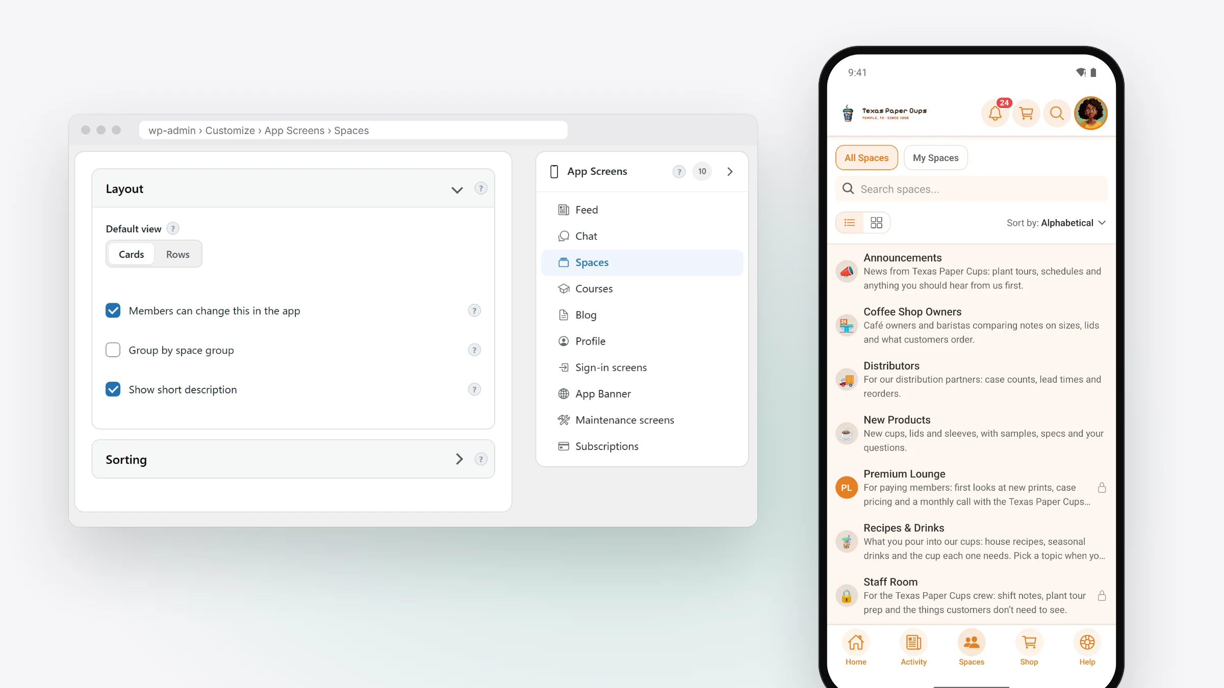
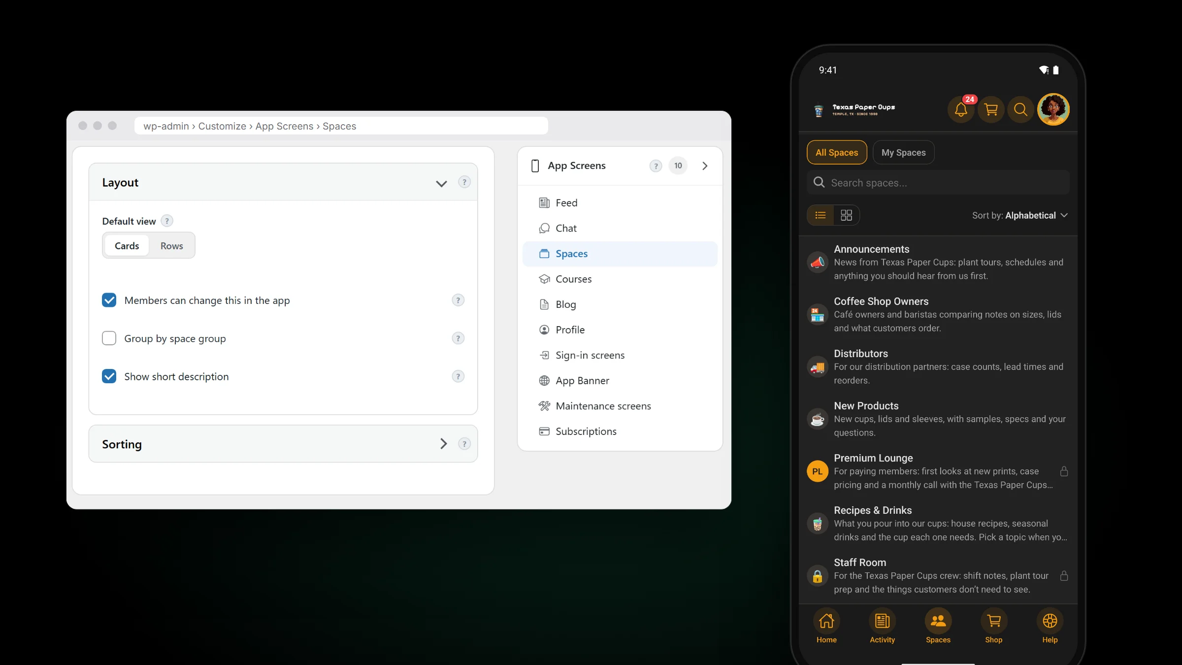
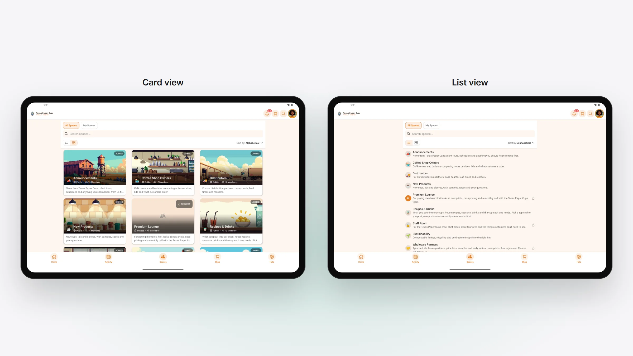
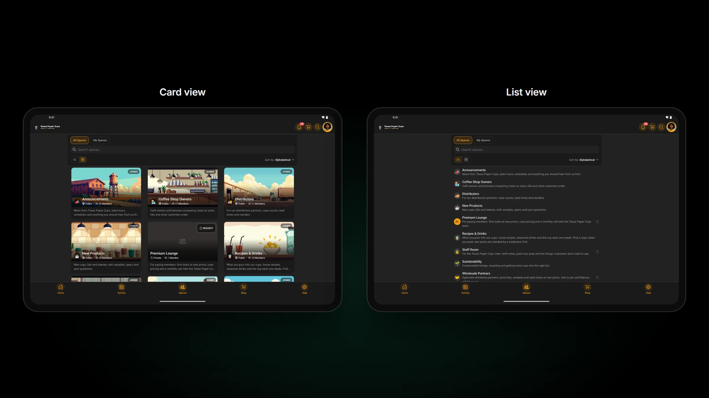
A community with a handful of spaces and one with dozens don’t need the same Spaces tab. 1.3.30 adds two switches, Group by space group and Show short description, beside the Default view you already pick. Mix them and you get any of the looks below. All three settings are in WP Admin › TBC Community App › Customize › App Screens › Spaces › Layout.
Every option in one place.
The phone preview beside the settings changes as you click, so you see the result before you save. The two new switches apply to everyone in your app. Cards or rows is the one members can change, if you let them.
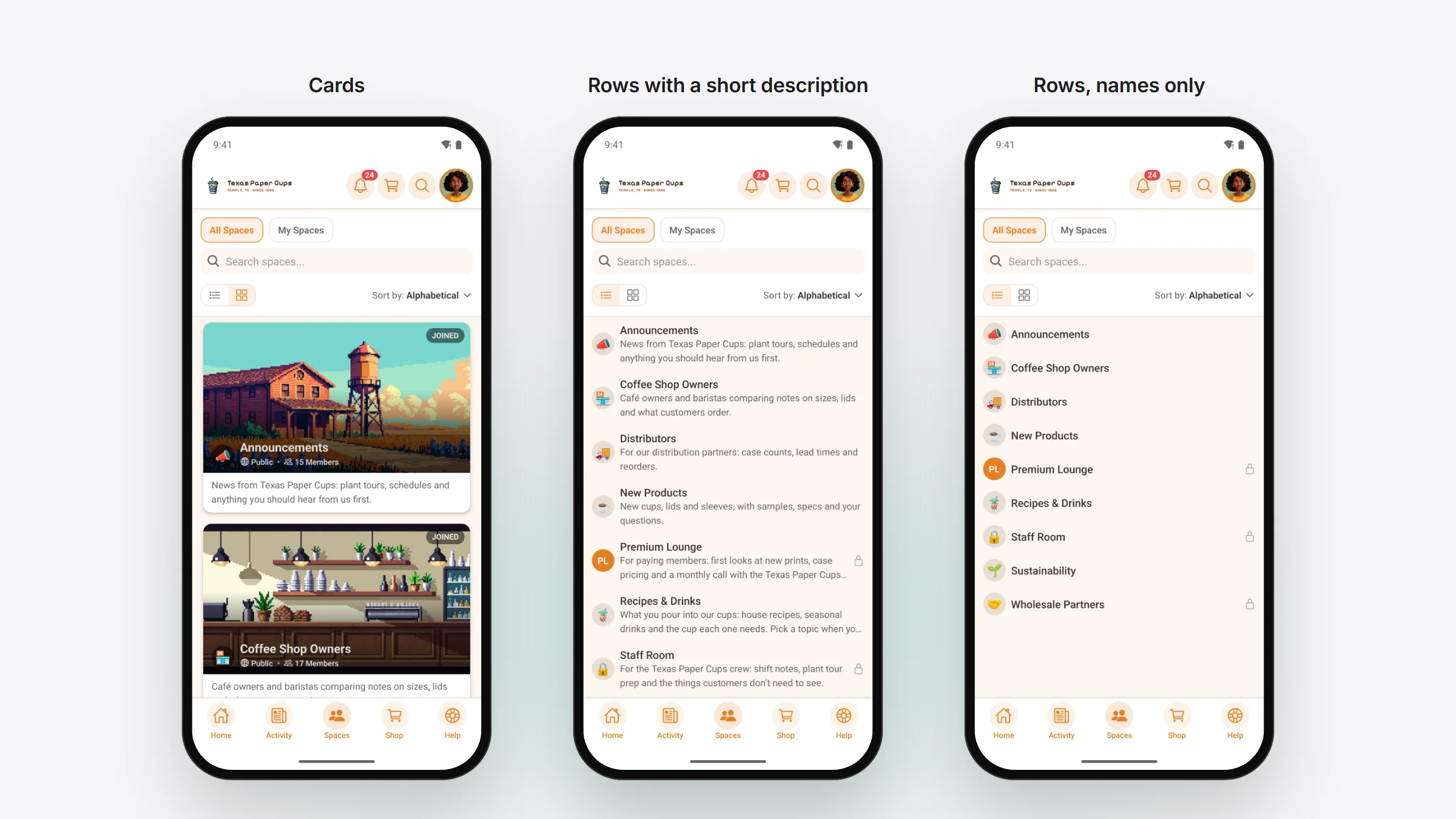
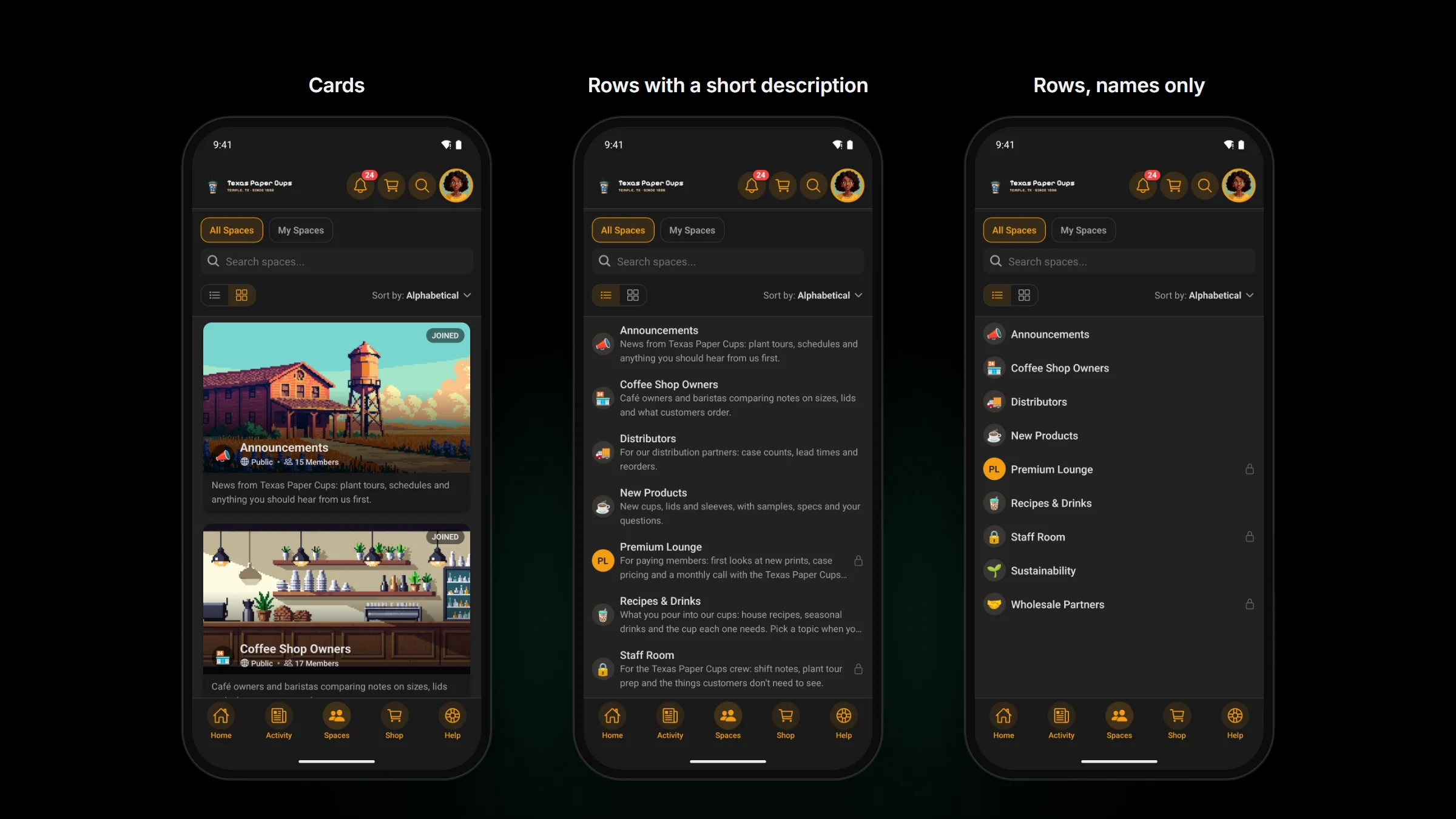
Cards, rows with a description, or names only.
Cards lead with each space’s cover picture, so spaces with good artwork get to show it. Rows fit more spaces on the screen. Show short description adds the first two lines of each space’s description, under the picture on a card or under the name in a row, so a new member knows what a space is for before opening it. Leave it off and rows are names only, the fastest list to scan.
Group them when you have lots of spaces.
With Group by space group on, spaces sit under their space group’s heading, and members can fold away the groups they don’t use. That keeps a long list easy to find your way around. With it off, every space sits in one list in your sort order, which is simpler when you have a handful. To keep the grouped sections your members see today, turn it on before your app takes 1.3.30.
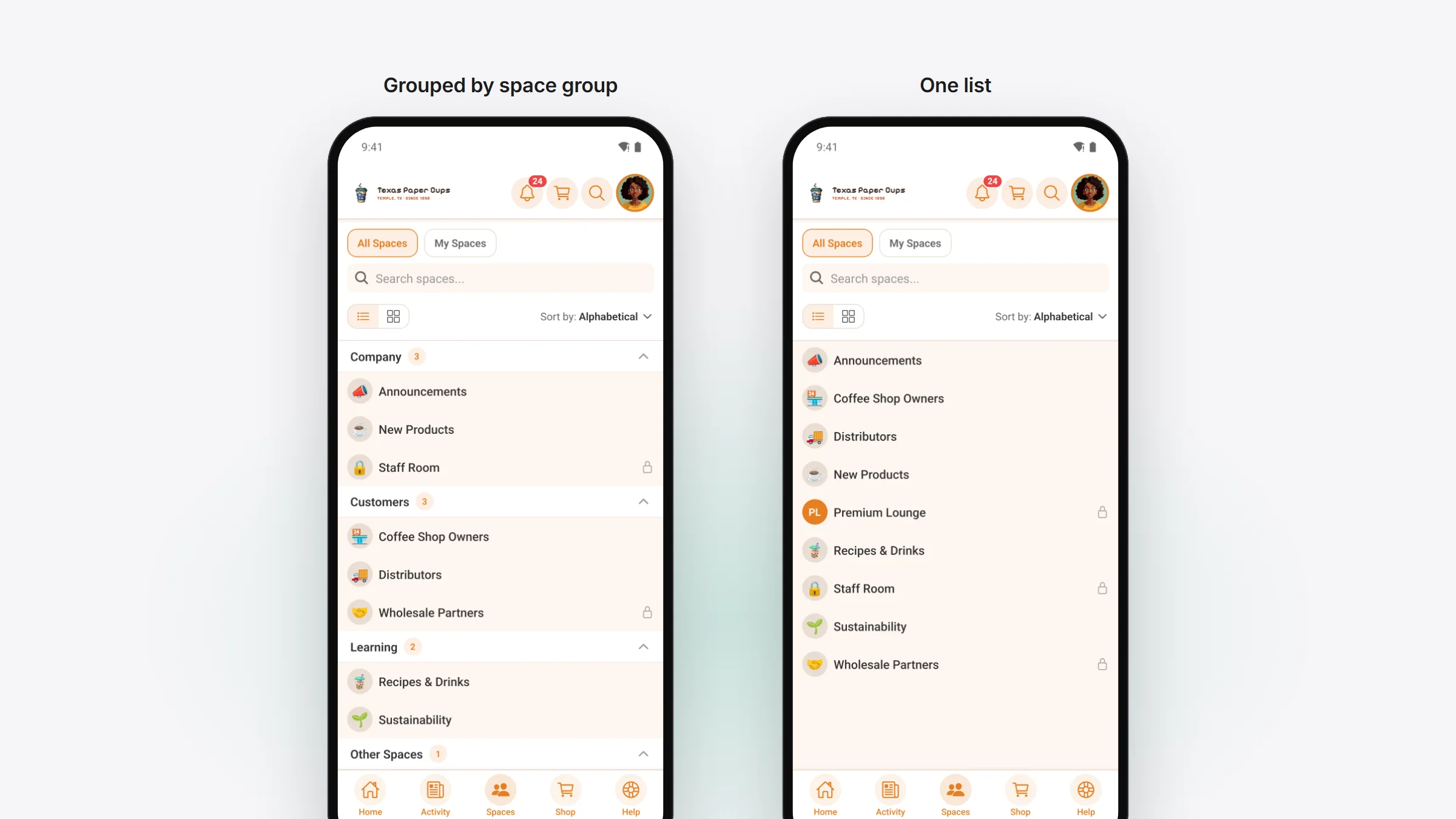
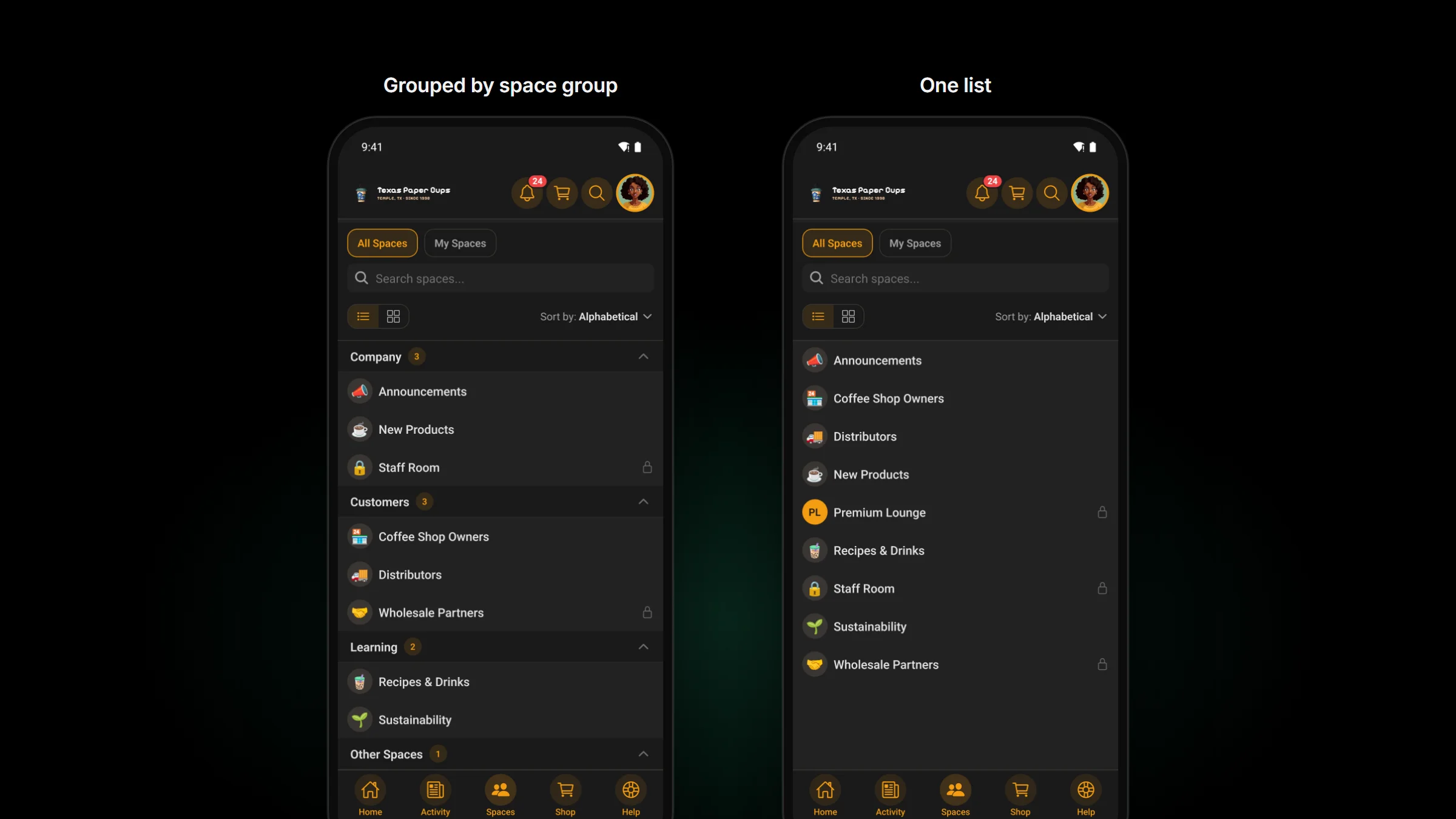
Or make the app match your website.
Fluent Community’s Spaces page on your website shows every space in one list, in the order you set. Leave both switches off, which is how 1.3.30 starts, and the app lists the same spaces in the same order. A member who knows one knows the other.
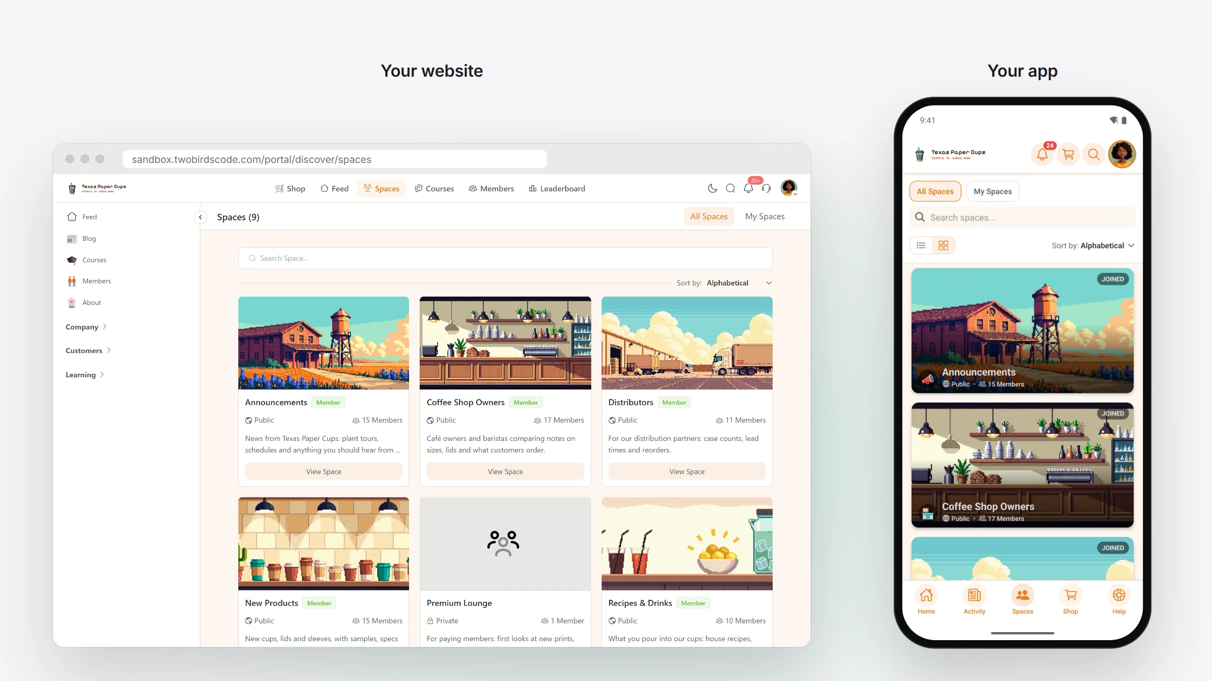
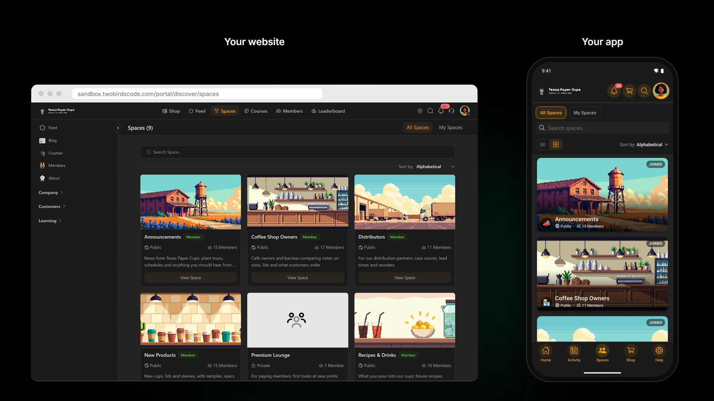
Made for tablets too.
On a tablet, card view lays spaces out two or three across, and list view gives each space a full-width row with room for its description. With one list, card view also loses the empty slot a group with an odd number of spaces used to leave.
Changed · links to other websites
Links to other websites open in the phone’s browser.
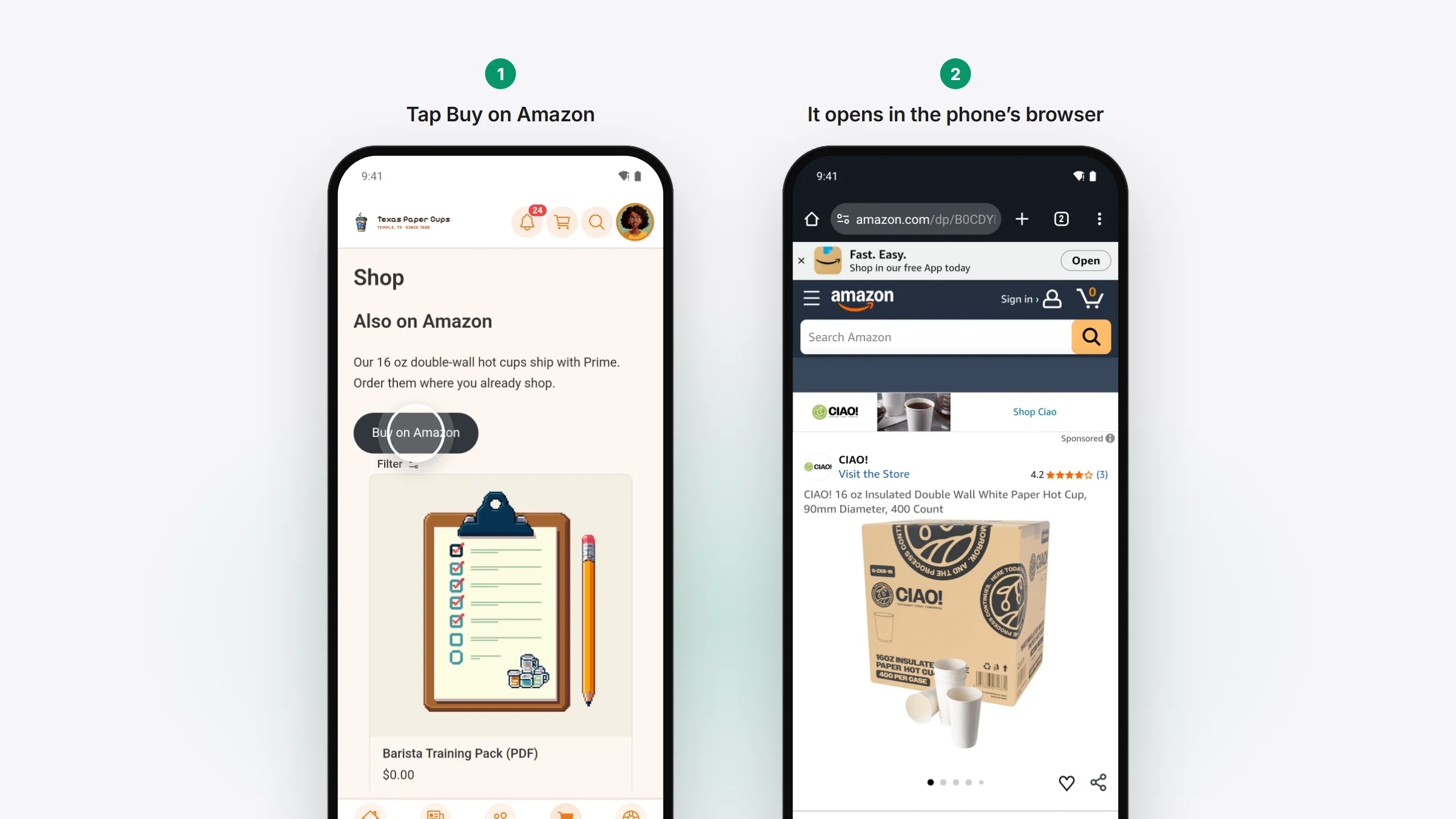
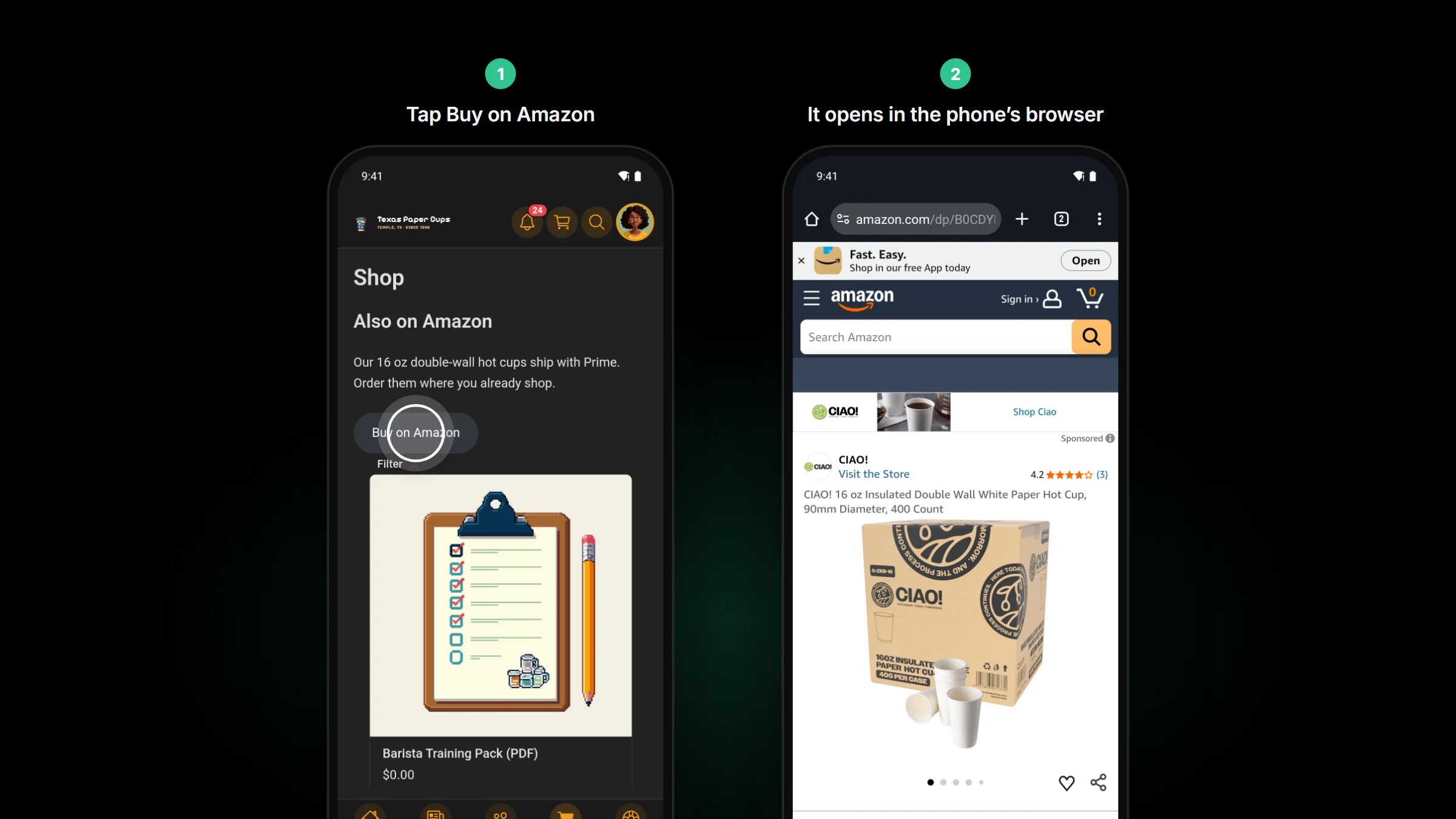
Say a page in your app has a Buy on Amazon button. Before, tapping it loaded Amazon inside your app, where the member wasn’t signed in and had none of their saved cards. Now it opens Safari or Chrome, or the Amazon app, and your app stays on the page they left. A shortened amzn.to link goes the same way.
What stays inside the app:
- Links back to your community, which still open its screens signed in, and your own site. An app on community.example.com keeps example.com in the app too.
- A website you set to open in the app from a menu item or tab, its subdomains included.
- Checkout. Stripe and PayPal open inside the app, so the member comes back signed in.
Fixed · tablets
Tablets switch views without gaps.
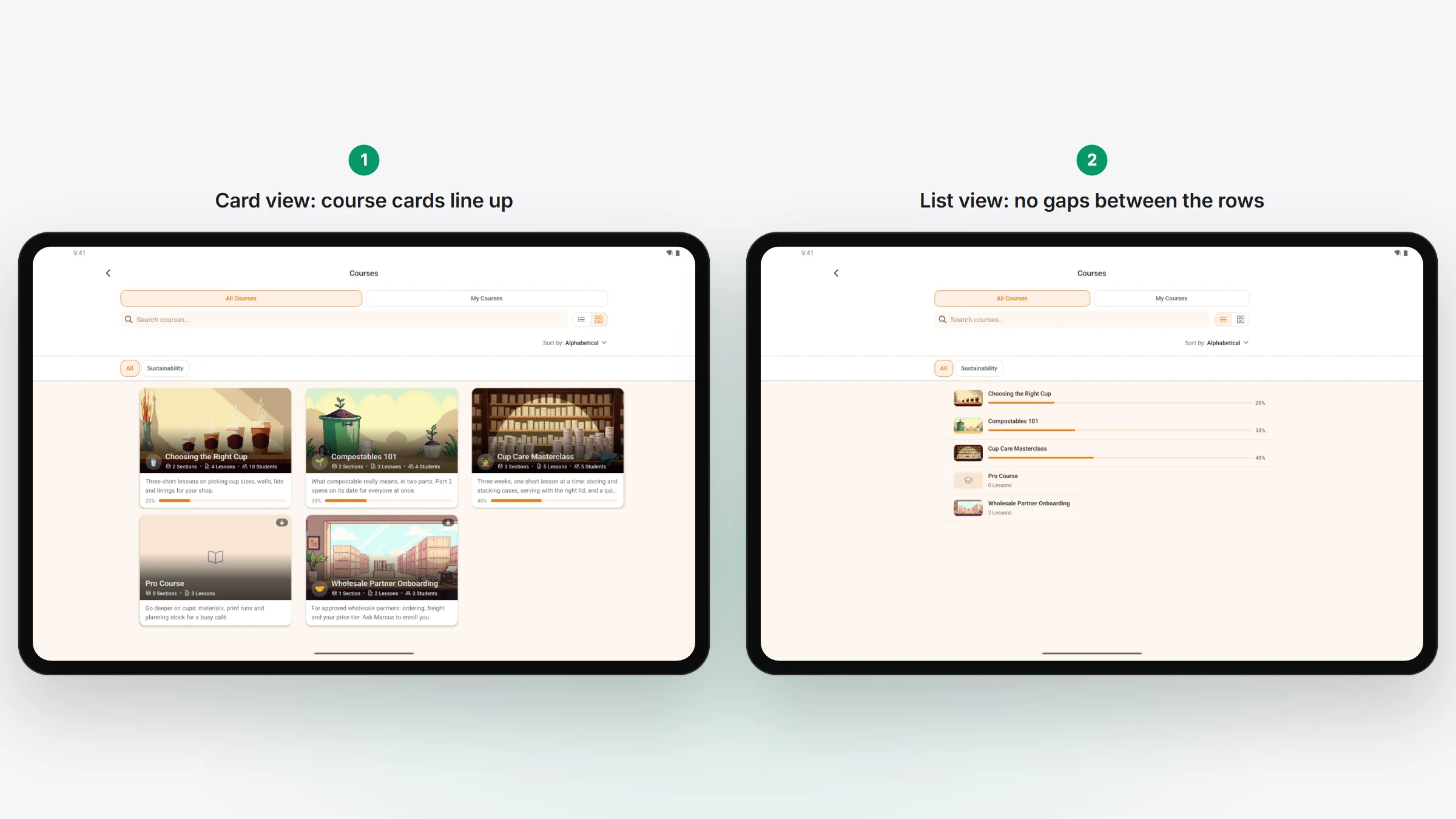
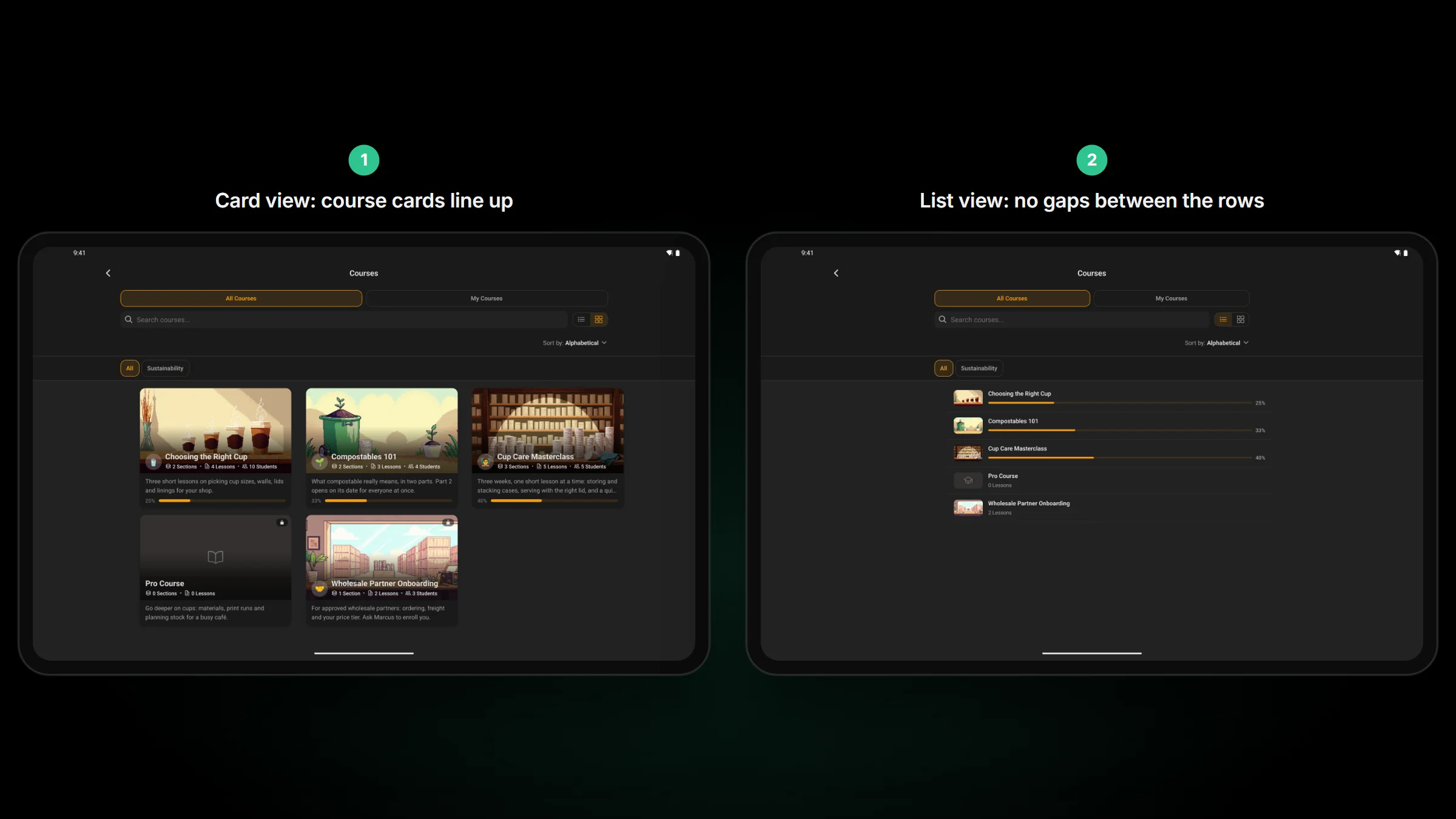
Switching a tablet from card view to list view used to keep each card’s height, so tall empty gaps sat between the rows until the app was restarted. Each row now takes its own height, on spaces, courses, the feed and every other card list.
- Course cards side by side line up at the bottom, even when one has no progress bar or no description.
- On an iPad, the Delete Account box shows Delete Forever in full, where it used to read “Delete For…”.
Fixed · web pages in the app
Every page the app opens can be read.
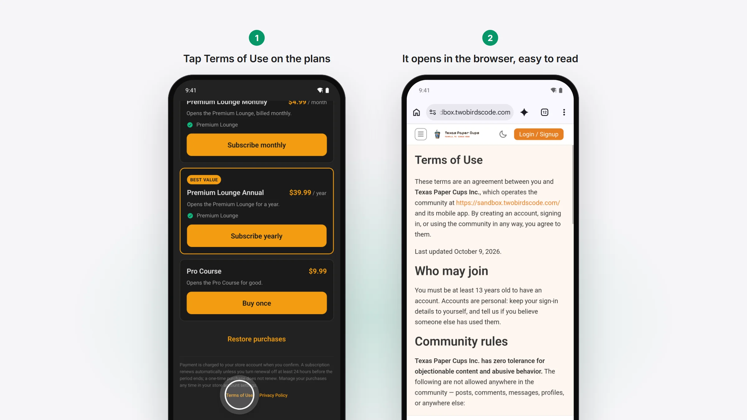
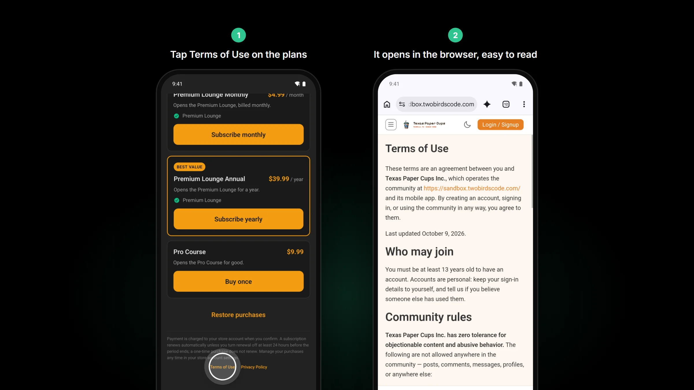
On a site that sells its membership in the app, the plans screen’s Terms of Use and Privacy Policy links opened underneath it, so tapping them seemed to do nothing. They now open in the phone’s browser, and closing it brings the member back to the plans. Apple’s reviewers check both links on the purchase screen. The same screen also stops flashing a “Renew on the web” card while the plans load.
In dark mode, a web page with no dark look of its own, like a Terms page on some themes, used to come out as dark text on black. It now shows light, as it would in a browser. Your community and any page with its own dark look stay dark.
Also in 1.3.30 · smaller fixes
And the rest.
For your members
- While your site updates its plugins, the app says “The site is updating. Please try again in a minute.” A like or comment sent in that minute is tried again, not dropped.
- When Cloudflare can’t reach your site for a moment, a screen that’s loading waits briefly and tries again. Likes, comments and anything else a member sends still go once.
- Audio on the iPhone and iPad lock screen shows its length and how far in you are. It could read LIVE before.
- A link to a chat opens that chat, even with another chat open in front of it. Better Messages
- A chat shorter than one page no longer offers “Load earlier messages” when there’s nothing earlier. It needs Better Messages 3.0.12 or later on your site. Better Messages
- Pages from your site hide a theme’s breadcrumb bar (such as Astra’s, under its header) and its back-to-top button in the app.
For you (site admins)
- With your license key entered, the Plugins page always offers Enable auto-updates for each TBC plugin, and WordPress then installs each new version by itself. The link shows once every TBC plugin you run is on this release or later.
- The review account that Top Up Access sets up joins your public spaces and every course except secret ones. It no longer joins private or secret spaces. Memberships it already has stay until you remove them.
- A YouTube channel with no public videos yet leaves the latest-videos widget empty, with no error. Saving a different Channel ID shows the new channel’s videos on the next load. YouTube
If you build your own app
- The dashboard’s suggested answer to the stores’ Unrestricted Web Access question is now No, to match how the app handles links to other sites.
- Release to stores can send a new set of screenshots that has as many pictures as your live listing. Tick its “same count” box.
- 1.3.29 came out on October 27 for people who build their own app: the dashboard’s Log In to EAS button, which stopped working with eas-cli 24.11, now uses Expo’s device sign-in.
Core 1.3.30 · before you update
Two things to know.
- Doesn’t need a new build. It can go out as an over-the-air update.
- To keep the grouped sections on your Spaces tab, turn on Group by space group in Customize › App Screens › Spaces › Layout before your app takes 1.3.30.