


Seems like pull to refresh doesn’t work anymore on the feed. Started when releasing the new animations.
Small issues, there seems to be a spacing issue at the top on iOS app portrait view (haven’t tried android) which only fixes itself when rotating device to landscape and back?
-
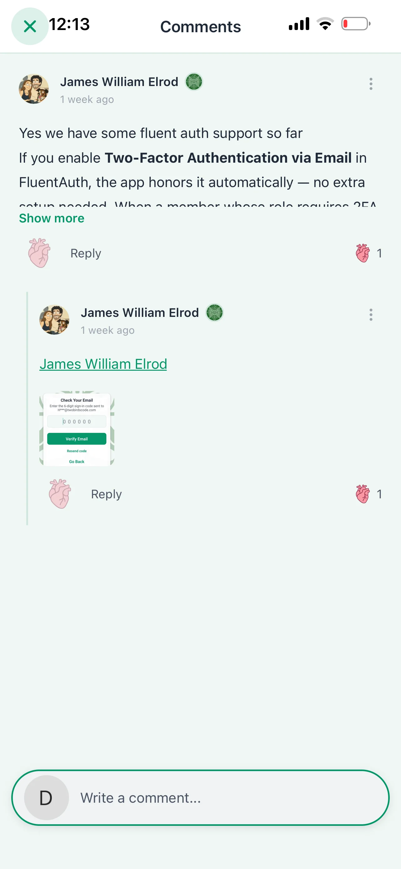
When viewing comments the X appears above which can’t be clicked.
-
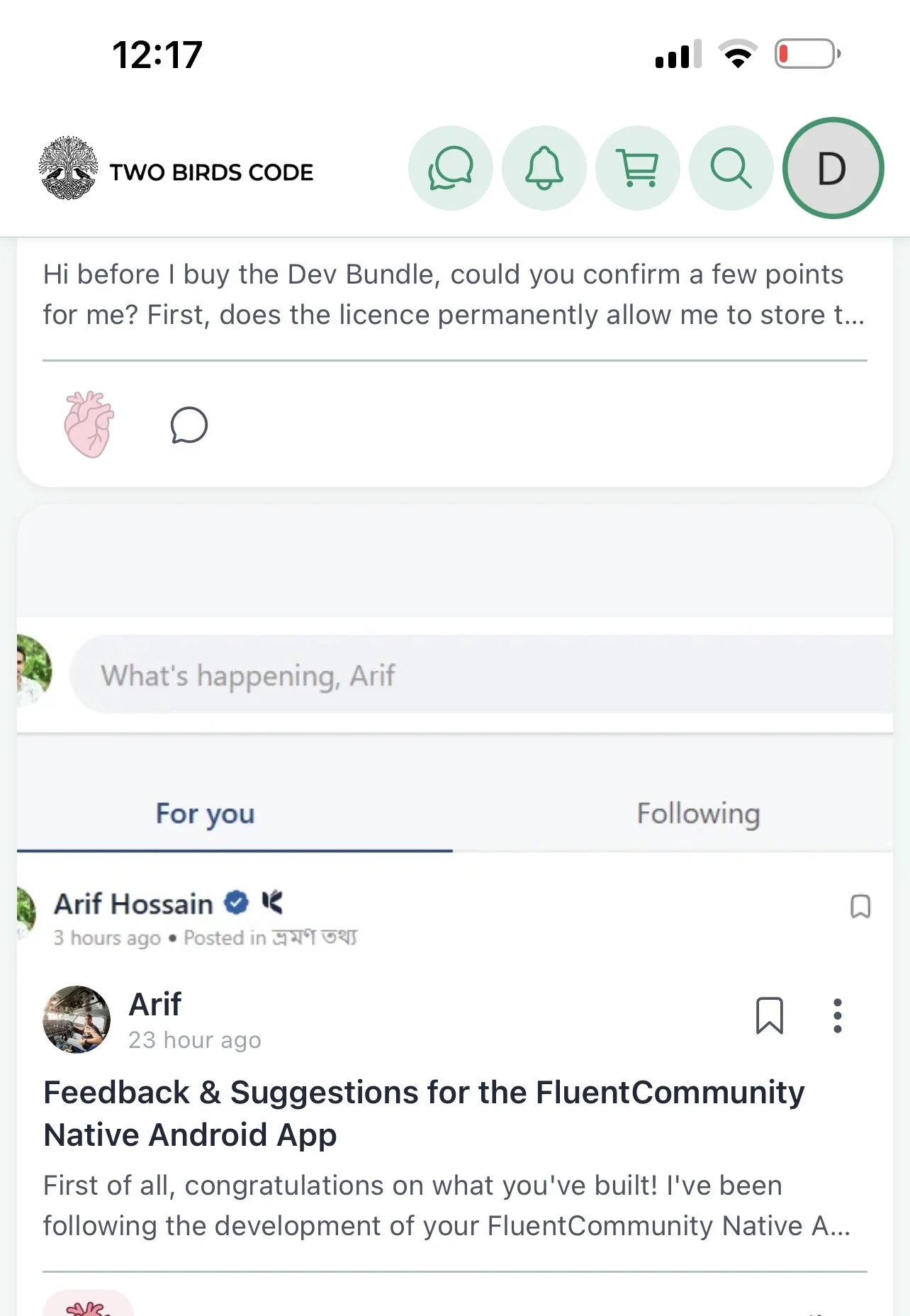
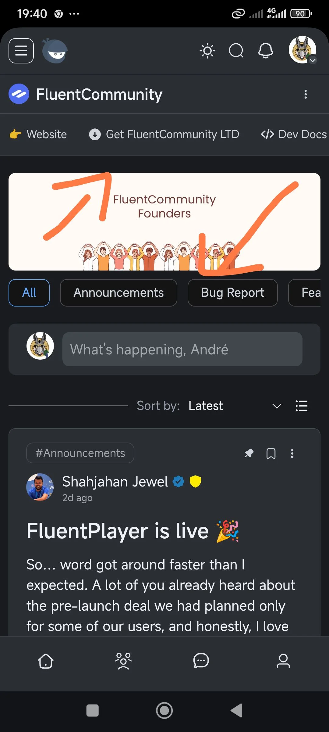
Feed wall shows top post stuck behind banner menu
-
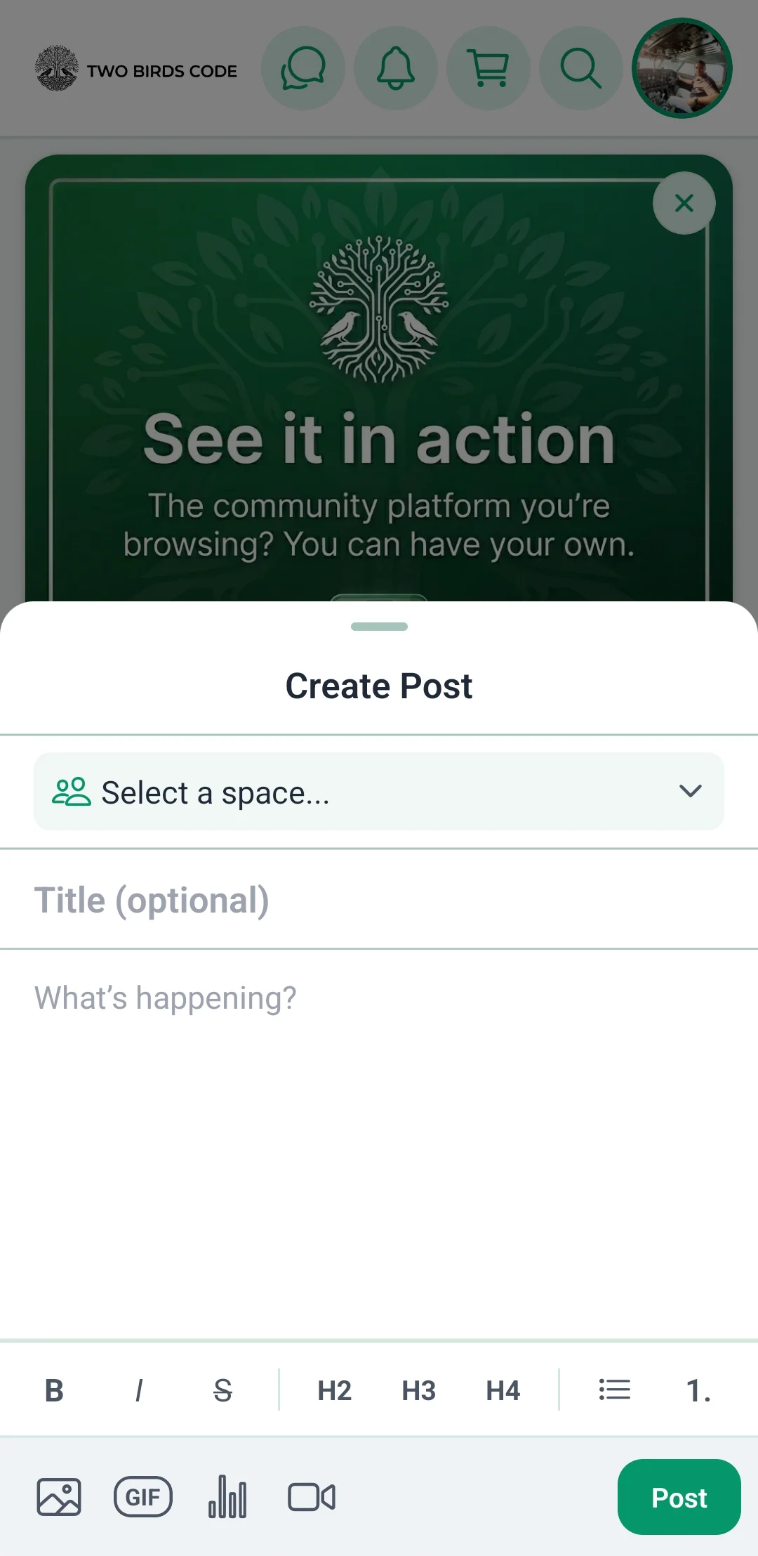
When adding image to post the whole comment section closes and we have to open it again to continue
Great progress so far 🙂
Hi before I buy the Dev Bundle, could you confirm a few points for me?
First, could you please confirm whether the Dev Bundle licence allows me to permanently store the full source code in my own private GitHub repository, modify it, work with third-party React Native developers, publish future updates through my own Apple and Google developer accounts, and continue running the app if I choose not to renew the annual updates? (Not that I plan too, for legal clarity)
I also use BetterMessages with FluentCommunity which they support. Will the app’s Message buttons open the same way and also show message count?
Finally, how does the blog section work? Can users search posts by title, content and do categories and tags appear linking on app? When someone taps a post tag or a link inside an article, can internal links stay within the app while external links open in the device browser?
Thank you

First of all, congratulations on what you've built!
I've been following the development of your FluentCommunity Native Android App closely, and I have to say that you've done an amazing job. It's exciting to see a dedicated native app for FluentCommunity, and I can already see many people talking about it and becoming interested.
Before adding many new features, I personally believe it would be worth polishing the core user experience. A more refined app will make a much stronger impression on the entire FluentCommunity community (12,000+ users) and encourage more people to choose your app over other alternatives.
What I Really Like
1. Notification System
The notification system and notification management are excellent. The design is clean, intuitive, and everything works really well.
2. Search Experience
The search interface is one of my favorite parts of the app. It's simple, modern, and very user-friendly.
3. Quick Profile Switcher
The quick profile toggle is fantastic. Having all the important menus easily accessible from one place makes navigation much smoother.
4. Settings Page
The Settings page is beautifully designed. It feels organized and professional.
5. Messaging / Chat
The messaging feature also looks great and feels much more natural than I expected.
6. Cache Management
The cache management system is another great addition. It's practical and gives users more control.
7. Admin Panel
Although I haven't used it personally yet, from your videos and screenshots, the admin panel and site management features look very well designed.
Suggestions for Improvement
These are just my personal opinions as someone who is genuinely interested in using this app.
1. Improve the Feed Layout
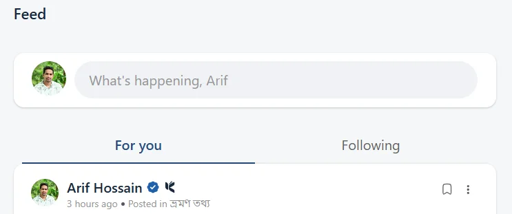
The current feed looks too much like the desktop version with boxed cards.
For mobile, I think a full-width feed similar to Facebook or X (formerly Twitter) would provide a much more natural mobile experience.
2. Redesign the Create Post Button
The current "Create Post" button feels a little distracting.
A floating circular action button in the bottom-right corner (similar to X) would be much cleaner.
Alternatively, placing the post composer at the top of the feed (like FluentCommunity on the web) would also work well.
3. Polish the Post Composer
The post creation box could use a bit more refinement. Right now it feels slightly awkward, but I believe with a little UI polishing it could become one of the best parts of the app.
4. Replace "Sort By" with "For You" & "Following"
Instead of showing:
- Latest
- Popular
- Oldest
I think it would be much more engaging to have:
- For You
- Following
Just like X.
- For You could display the Activity feed.
- Following could display posts from followed users.
This would encourage users to follow each other and make the community feel much more social.
5. Google Sign-In
Google Sign-In should be included. I believe this is almost essential for a modern community app.
6. Native Comment Styling
The Heading (H1, H2, etc.) formatting inside comments doesn't feel right.
Comments should look like native social media comments with simple, clean text formatting.
7. Support Custom CSS & JavaScript
Many FluentCommunity sites use Custom CSS and JavaScript for branding and extra functionality.
It would be great if the app could respect those customizations wherever possible.
8. Improve the User Profile
The profile cover image and overall profile UI could be more polished and user-friendly.
Profiles are one of the most visited parts of any community app, so making them feel premium would be a huge improvement.
9. Add the Leaderboard
FluentCommunity already has a great Leaderboard feature.
It would be wonderful to have it available inside the app as well.
Final Thoughts
Personally, I think focusing on these improvements before introducing many new features would make the app significantly stronger.
A polished user experience is what will convince the 12,000+ FluentCommunity users to choose your app over other solutions.
I've been following your progress regularly, and I'm genuinely excited about this project. I definitely want to purchase the app once it's ready.
One small request: please keep the pricing as affordable as possible. I believe a more accessible price will encourage many more FluentCommunity users to adopt it.
Once again, congratulations on building something the FluentCommunity ecosystem has been waiting for. You've done an outstanding job, and I'm looking forward to seeing how the app evolves in the coming months.

https://www.twobirdscode.com/blog/item/tbc-banner-roation/
was getting questions on the backend for this plugin so added a quick little video.

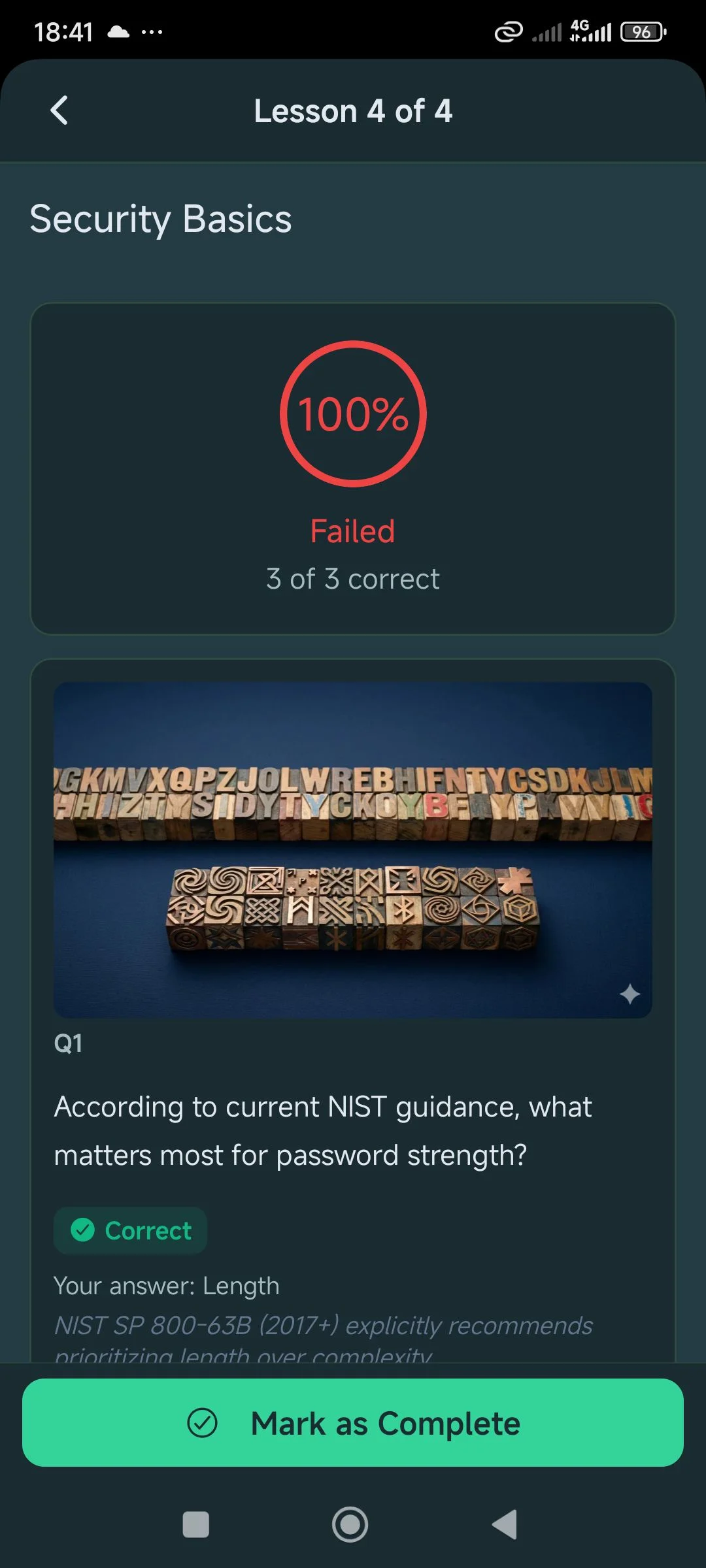
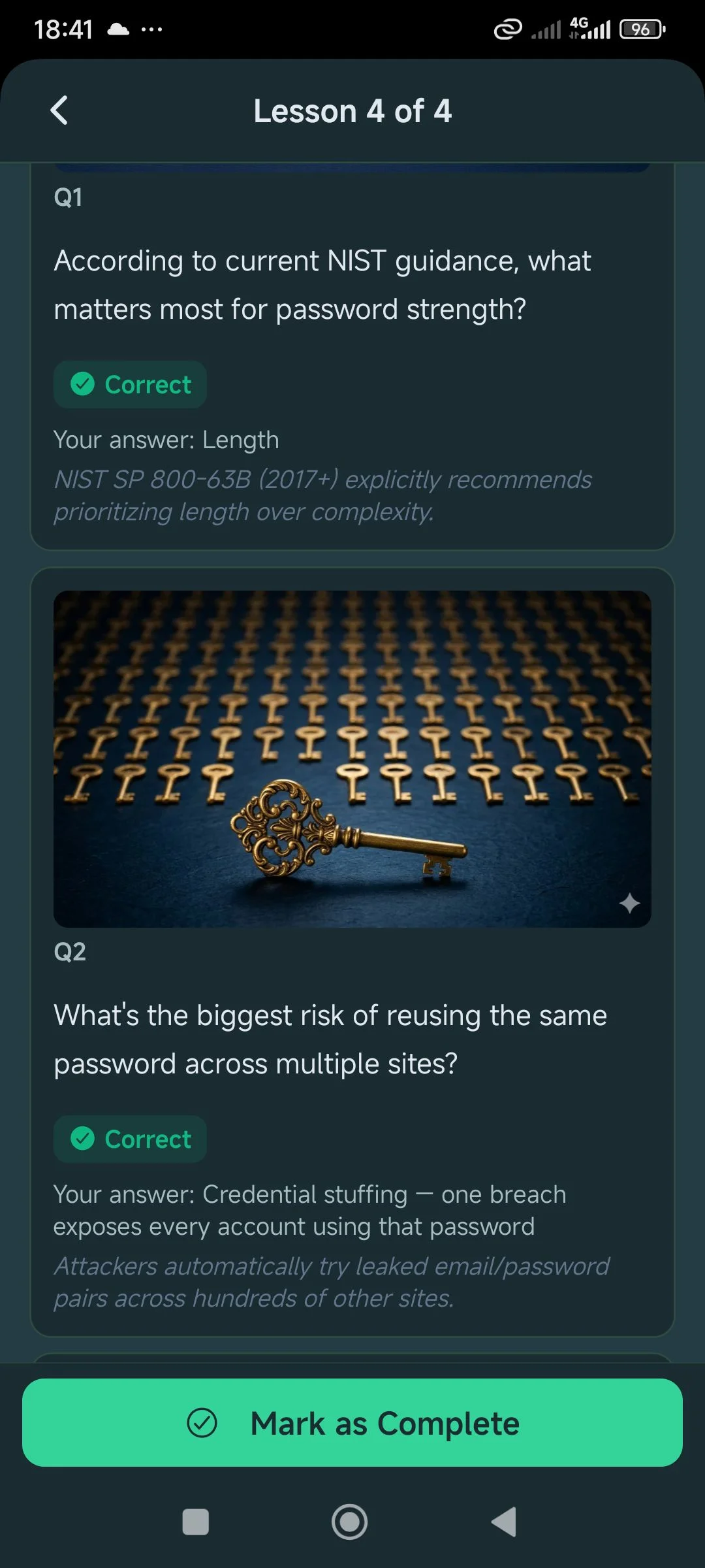
I failed the 3 quizzes questions. But the way that shows it looks like all 3 were answered correctly
Will you integrate fluent player in the app?
First problem on iOS when you register it demands profile and cover it photo. If you try to write something about yourself the keyboard hides the selection of the photo so it’s impossible to complete the step. Had to close the app twice to do it